Title / Logo
Helping a Comic Book artist level up his unique style
Overview
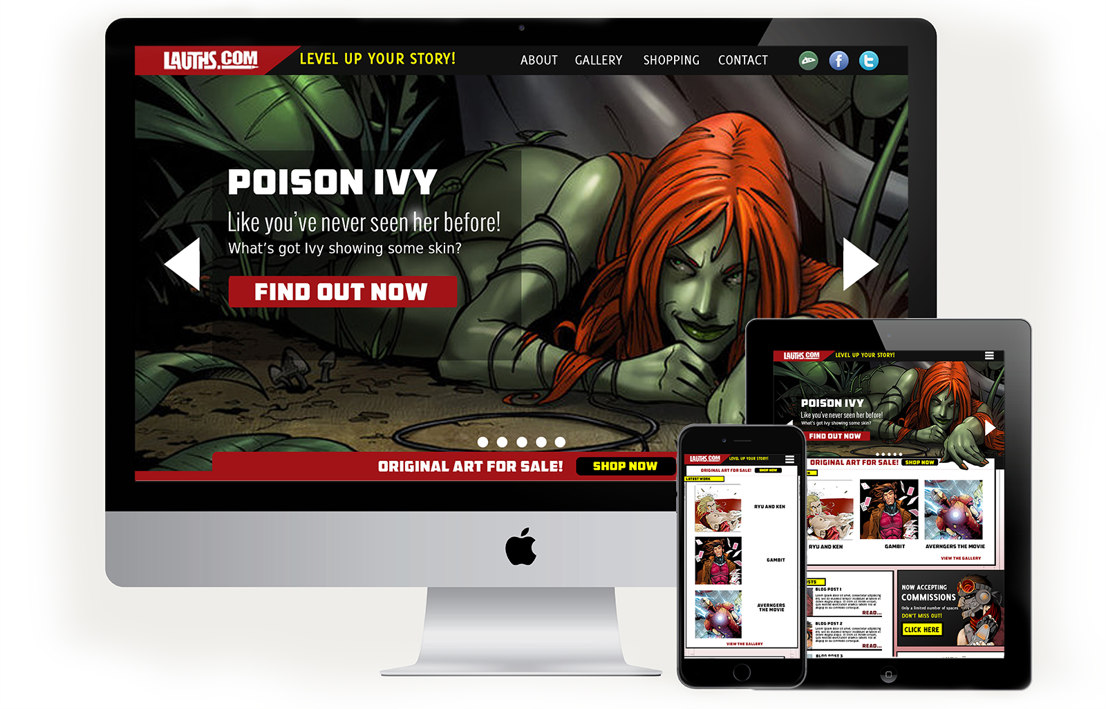
Mark Lauthier is comic book artist based in Perth, Australia. His unique style and active social media presence have garnered him fans around the world. When he decided that he needed a unique website to showcase his art and introduce fans to his original material, I helped him craft a responsive and highly customized WordPress site, inspired by his bold and creative drawing style. There is a unique challenge when it comes to crafting a user centered design for this kind of client website. It is imperative to balance the needs of the user with the needs of the client. It is as much a portfolio site that allows the client to flaunt his work as it is a fan site designed to give the users a more personal look into their favorite artist.
My Role
I was the sole designer for this project. I created a highly customized comic book inspired website with a gallery and web comic as well as portals to Mark’s social media and ecommerce sites.
The Process
Early Research
We spent many of the early days on this project reviewing both small and large scale comic book sites with an eye on content, design aesthetics and user experience. I had created comic book inspired sites before and seen other attempts at it as well; I knew that sites like this could easily come off as tacky. Early discussions revolved around the necessity for an art site at all; Mark already had a presence on ecommerce and social media sites like RedBubble, Deviant Art, Etsy, Instagram, Facebook and others - why did he then need a personal art site? Some statistics indicated that artists, like most small business owners, were considered more professional if they had a personal web presence, so we rationalized that making Mark appear more professional by having a personal website would enhance the user’s experience. The result would be a site that was uniquely him because it expressed his personal comic book style.
Establishing Brand
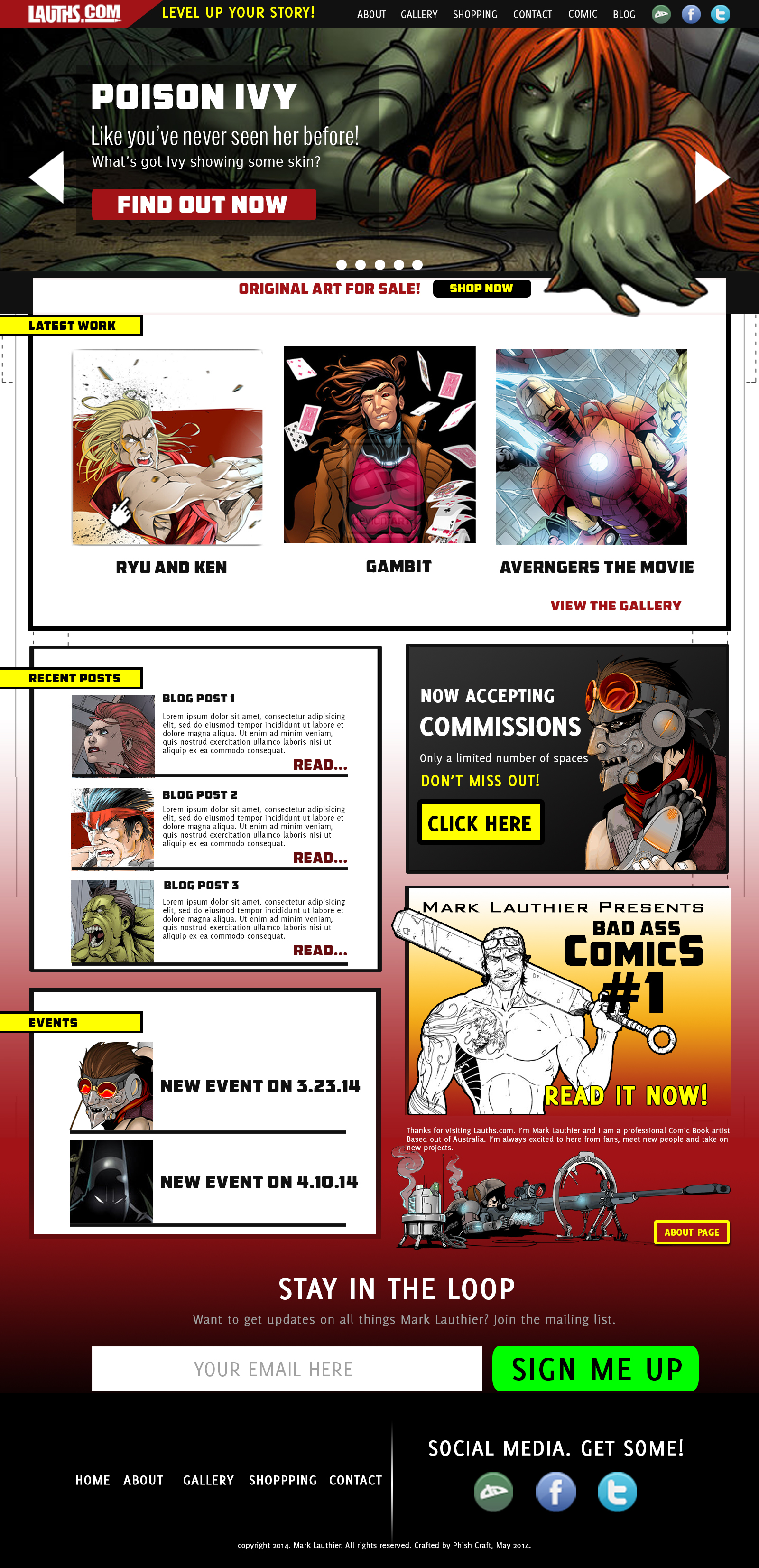
Creating a personal site for Mark had the additional benefit of reestablishing a brand that he had let flounder for some years. He had an older site that fell out of use and saw no traffic and a logo that was well designed and still usable. He lacked a consistent color palette and typography so we sought to establish these elements by leveraging the existing elements. I chose bold colors that were reminiscent of powerful superhero costumes and created a sense of intensity. We also used a heavy amount of black which was reminiscent of the inked style of comic books as well as a hint of Blue Line Pro texture which is a staple of the comic book artists toolkit.


Wire Frames
In my early concepts I explored using as many elements of the old site as possible. I did these early sketches in color and quickly realized that I was missing a critical component: structure. So, I went back to basics and created wireframes with an eye on making sure that a more traditional website layout was firmly in place so that I could add color and texture and conceptualize dynamic elements without compromising the core build of the site.


Mock ups
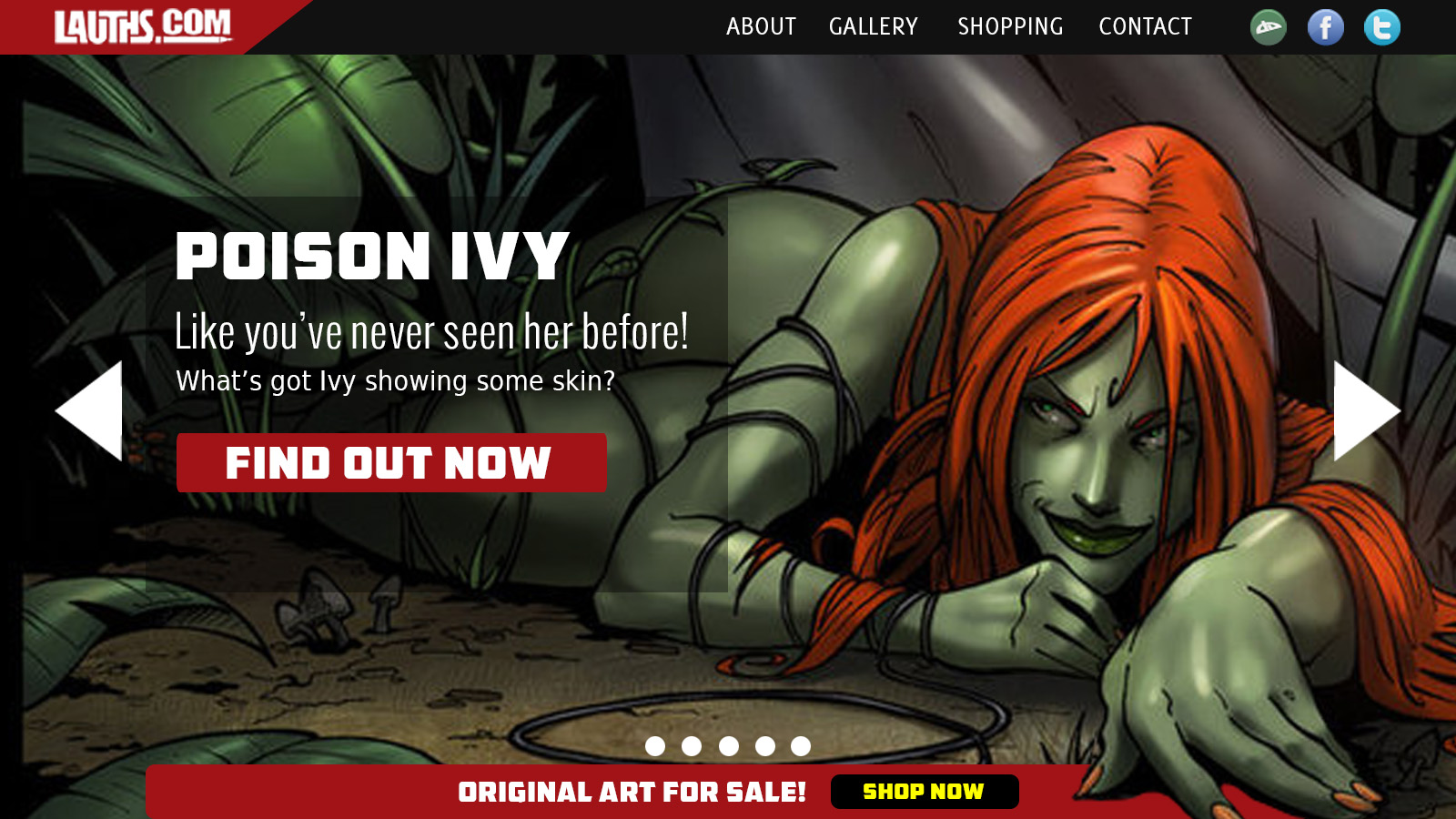
I went through a few versions of mockups in basically two phases. The first phase included an image slider that cycled through different projects. At the time we thought it was an effective way to add value and to showcase some of Mark’s most popular art upfront. About a year or two after the site launched, we decided to do a revamp. I initially had some trouble implementing design features like the Blue Line Pro texture and we decided that a single large hero image would allow him to promote his new comic, which fans had been asking for.

The Conclusion
This is probably my favorite project because it allowed me to design for a kindred spirit. I grew up on comics, I learned to draw because I love comics and that led me to design. So, for me this was a chance to pay it forward so to speak and to work on a project that was uniquely tied to my past and my roots as a designer. It was also the first time that I worked with a client in a foreign country, let alone the other side of the world — an experience that presented its own interesting challenges.
That said, there were some points of failure in this project. Mark really wanted to manage the website himself and I was happy to let him do that. But I did need to teach him how to use Word Press and we quickly realized that it was a much bigger commitment than either of us anticipated. This project was also a really good example of how life can get in the way especially when the client and the designer are worlds apart. We ran into numerous timing issues and delays and it ultimately caused the project to run much longer than either of us had planned.
There were some valuable lessons learned during this project. Most importantly, good user experience in not just about design or understanding what your users (or fans) want from you. It’s about having a plan to not just execute but to maintain the site as well. This site was most successful when it was regularly maintained and user engagement on the site suffered when it wasn’t. In the end both client and designer accomplished a great deal with this site so while not perfect I would happily call it a success.