Title / Logo
Bridging the Gap Between Design, Code, and Copy
Overview
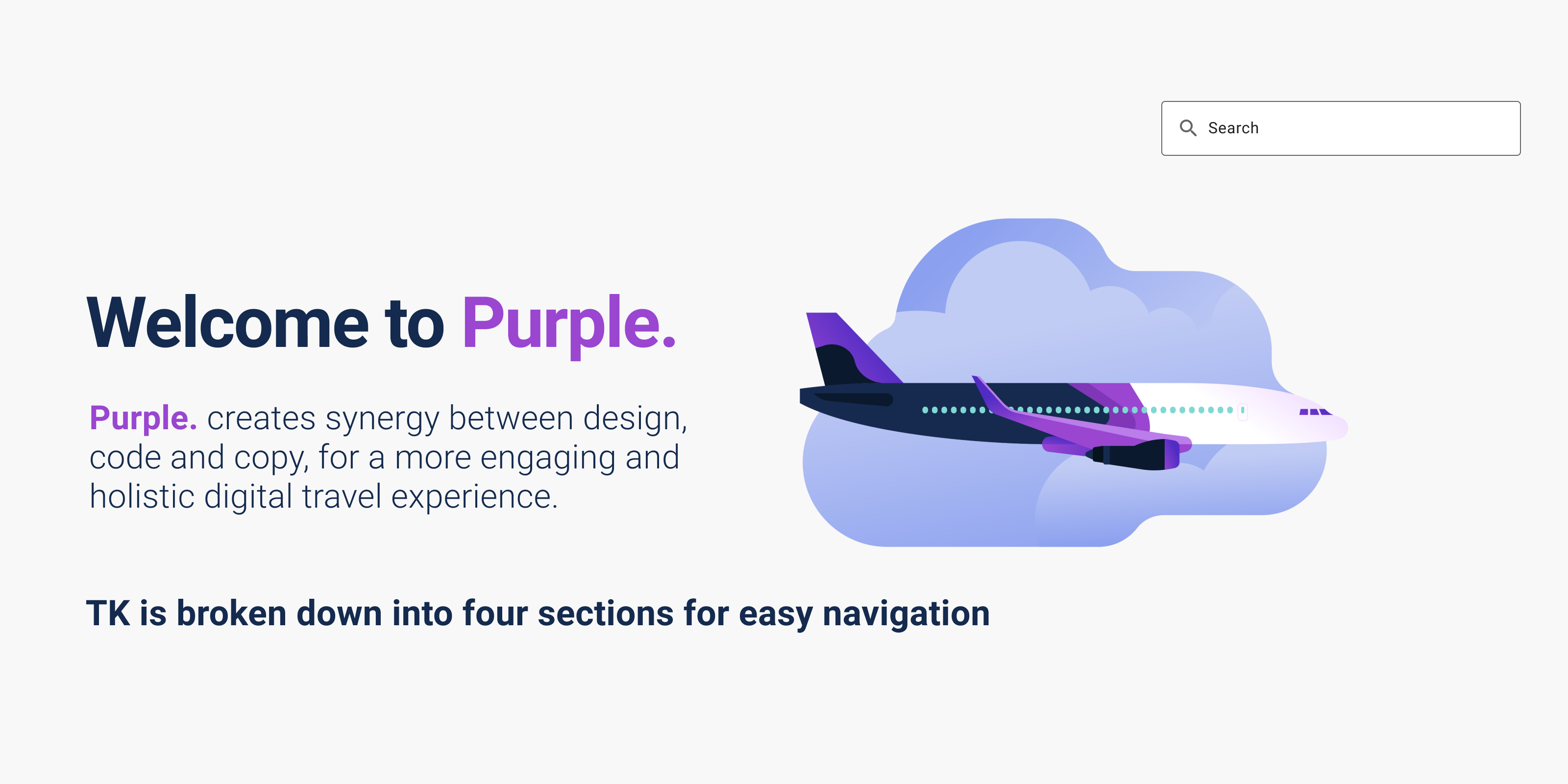
Purple. was the working name for the design system we had begun developing at Upside Business Travel. When I joined the team, there was already a small design team and a sizeable engineering team that had built out a robust product platform. However, the rules and structures that design and engineering were using weren’t always aligned. So, the primary purpose of our design system was to established a unified methodology and product representation between design and engineering. We also began to address concepts of UX writing to ensure that the rules established around all product related copy were easy to access. Future versioning of the design system, would begin to explore a departure from the out of the box solution we started with and the adoption of flexible, customized code that would be open source. Unfortunately, we never got to complete this project but the exploration and concept work that we did is worth noting.
My Role
I was the lead designer for the design system and worked with two other designers, a UX writer and several front-end engineers to deliver the first version of Purple. to our internal users.
The Process
Early Sketches
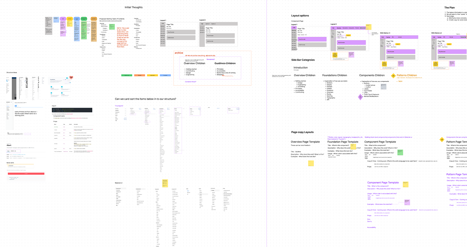
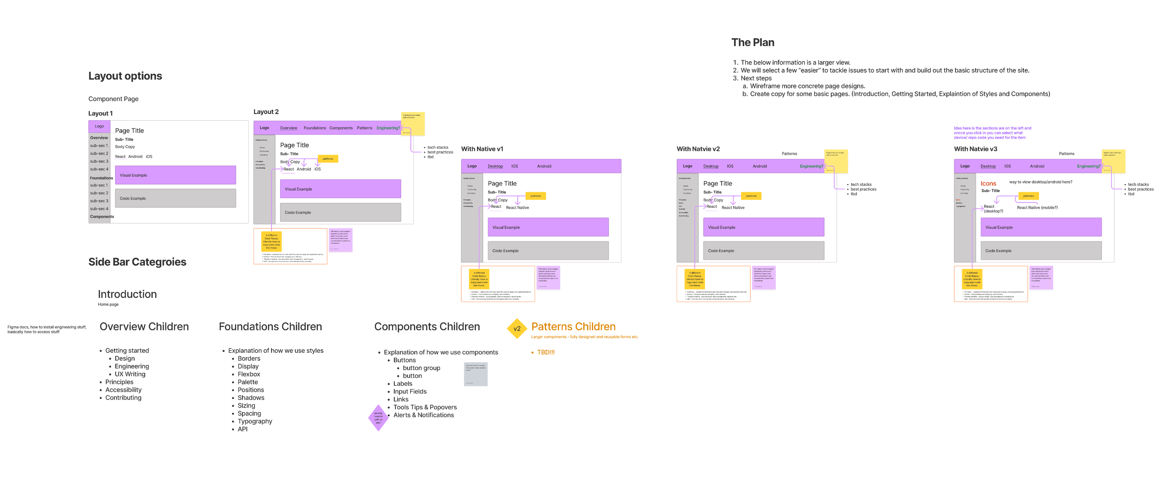
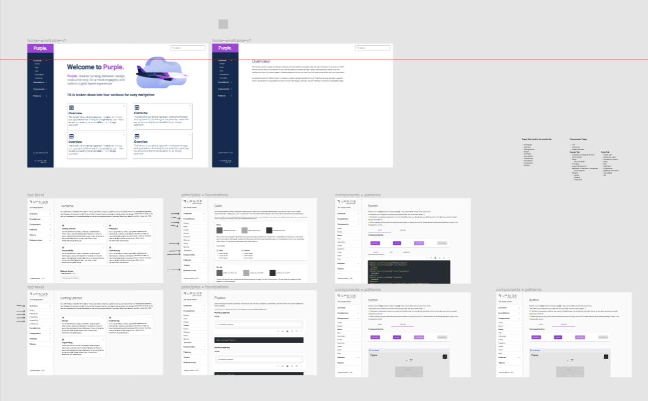
We started this process with a whiteboarding session in Figjam. The primary goal was a quick delivery of the first version. We wanted something that could be used internally as an onboarding tool to help new hires get started. We also had lots of thoughts and inspiration from other successful design systems and we needed to get all the thoughts on paper so we could slim down to the most important elements.
Wireframes and mock ups
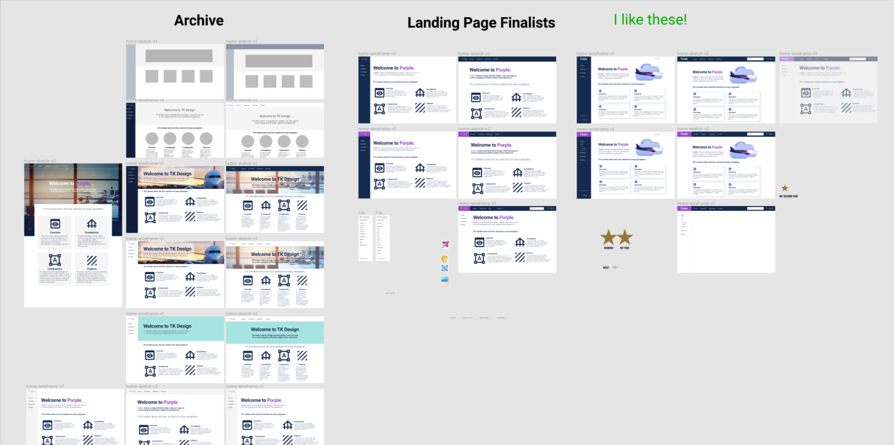
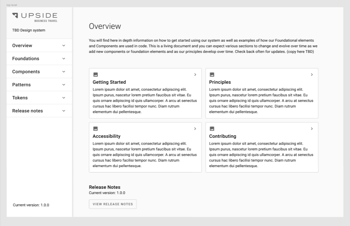
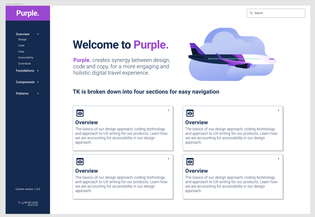
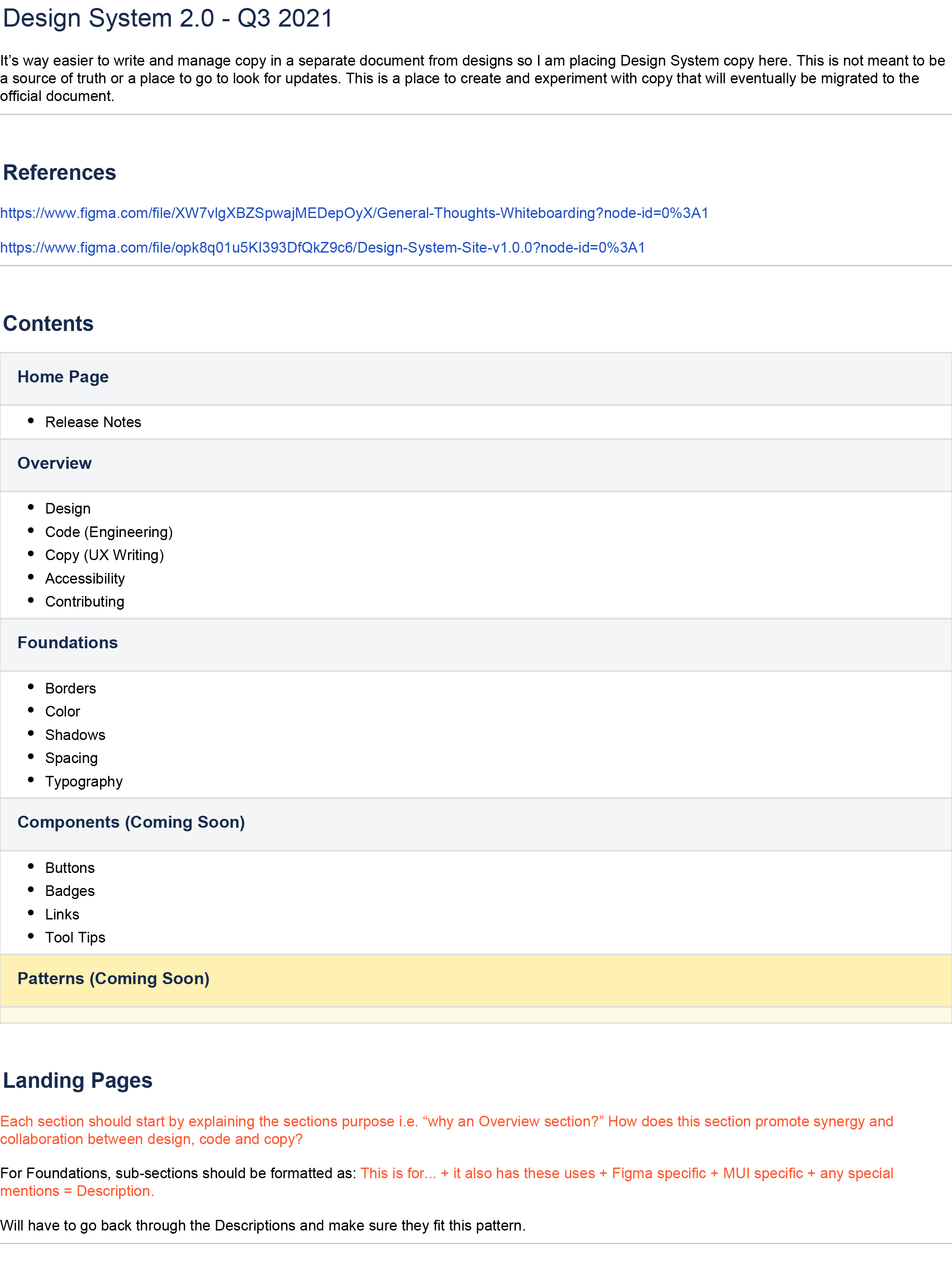
Sometimes I have so many ideas in my head I just need to make a mess and then see what comes out of the ashes. We started with simple sketches. One of the other designers formed those in to wireframes. I had some initial color concepts and we used bits of both approaches to flesh out the final look and feel. Our early whiteboarding helped us establish our navigation structure which I refined in a Confluence document. This is also where a drafted all of the copy for version 1.0.0. With some early draft work finished we were ready to start building pages in Figma.
Approach
Structurally, the design system was divided into Overview, Foundation, Components and Patterns. We had planned to leverage the components that we built into our Figma Library in conjunction with reusable code snippets to create an easy reference for engineers and designers to bridge gaps in their understanding and easily identify areas in the existing product that were out of standard. This would ensure greater design consistency over time and improve efforts to clean up code and visual layout. Where applicable, instructions for correct application of copy including, tone of voice, maximum characters and any other rules were added since product designers often took the first run at copy for their projects.
The Conclusion
The primary success of this project was the tremendous support that we had from the organization to tackle this work. A small self-motivated team of designers, front-end engineers and UX writers collaborated to make the design system happen and we made great headway in the less than two months prior to Upside closing down. We were successful is beginning the long process of bridging the gap and improving relationships between, design, copy and code in our organization and all indications suggest that we on track to take that conversation even further.