Crafting a simple solution for a complex workplace
Overview
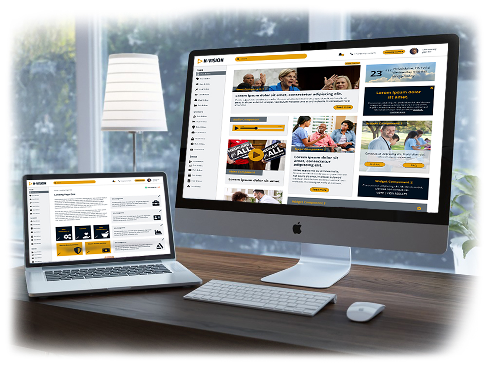
N-Vision is a mock project based on the intranet redesign that I’m currently working on. The core challenge is to bring an outdated and non-mobile friendly intranet into the modern age and make it easier for associates to find the tools and resources they need most. This challenge is exacerbated by the sheer size of our intranet, which is currently 2000+ live pages and 5000+ files making it necessary to audit and archive many files before we can even begin design work. Additionally, we need to meet 508 compliance/accessibility, as well as various other legal requirements that require certain content to have more importance. Given the company’s level of technology and the scope of the project we are forced to work around older code and launch a partially responsive site yet produce a seamless user experience.
My Role
I lead the UX Research and UX Design phases of this project. We are currently in the prototyping phase.
The Process
Early Ideas
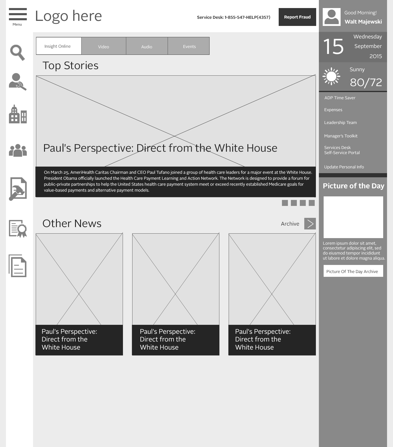
I had been suggesting a project like this for a while before we finally got approval to move forward with the project and I already had some wish list ideas for what it could look like. I had read several articles on current intranet trends and since I had been the sole designer for the intranet for a few years at that point, I also knew that associates often had trouble finding things that they needed most. So, my early sketches were based on reorganizing the site’s content within the existing architecture.
Early Research
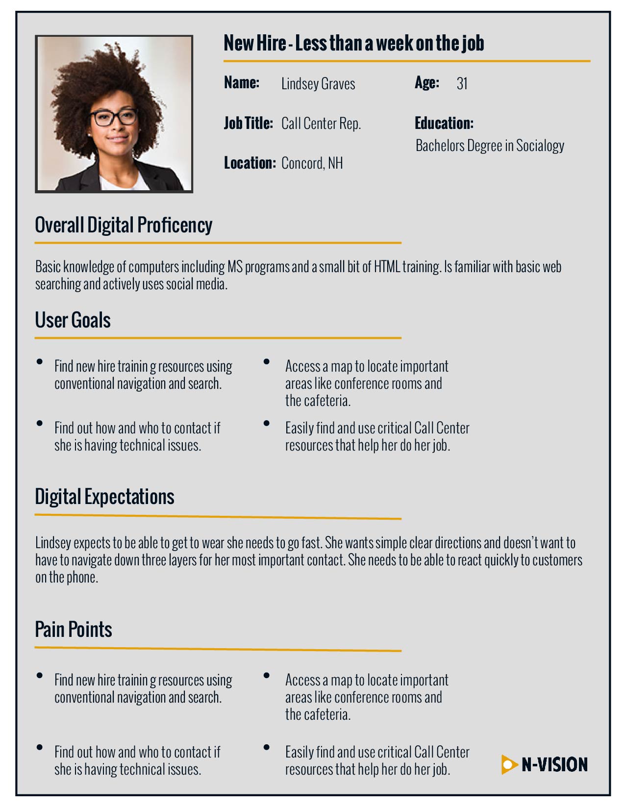
Once the project actually began, I set out to collect my early ideas and combine them with our team’s user research. We held focus groups with users from all of our markets and used the information from those focus groups to create user personas and journey maps. We used this data to justify a new site navigation and architecture. After combining this data with our external research into modern intranet best practices, we felt confident to set up a project plan and move into the wire framing phase. In order to keep the project as Agile as possible we determined that we would do the redesign in phases, starting with the Home and Primary Landing pages.
Establishing Brand
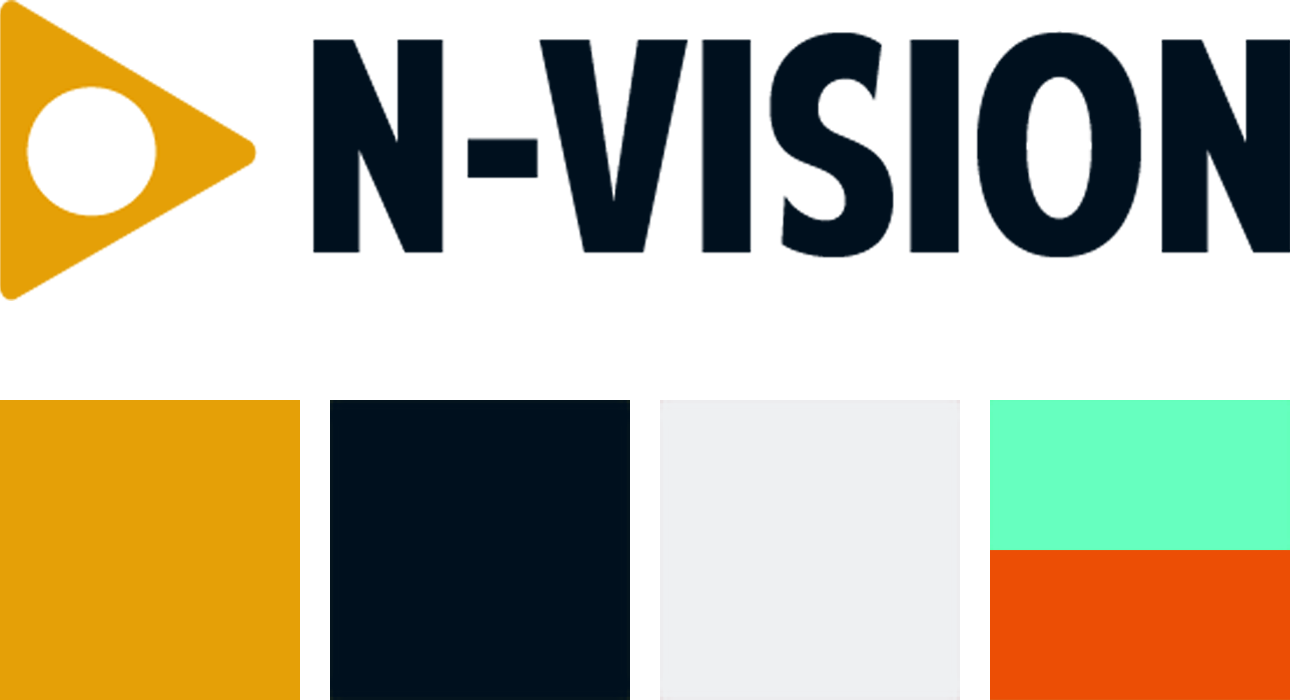
As a secondary part of this project we designed a new logo to enhance the new intranet. We partnered with graphic designers, established new colors and new typography as well as a new UI kit. Along the way we saw an opportunity to expand the brand beyond just the website and we used our new design assets to create a press kit showcasing how the intranet brand could be used as a fully integrated internal brand including email blasts, digital signage and print collateral.


Wire Frames
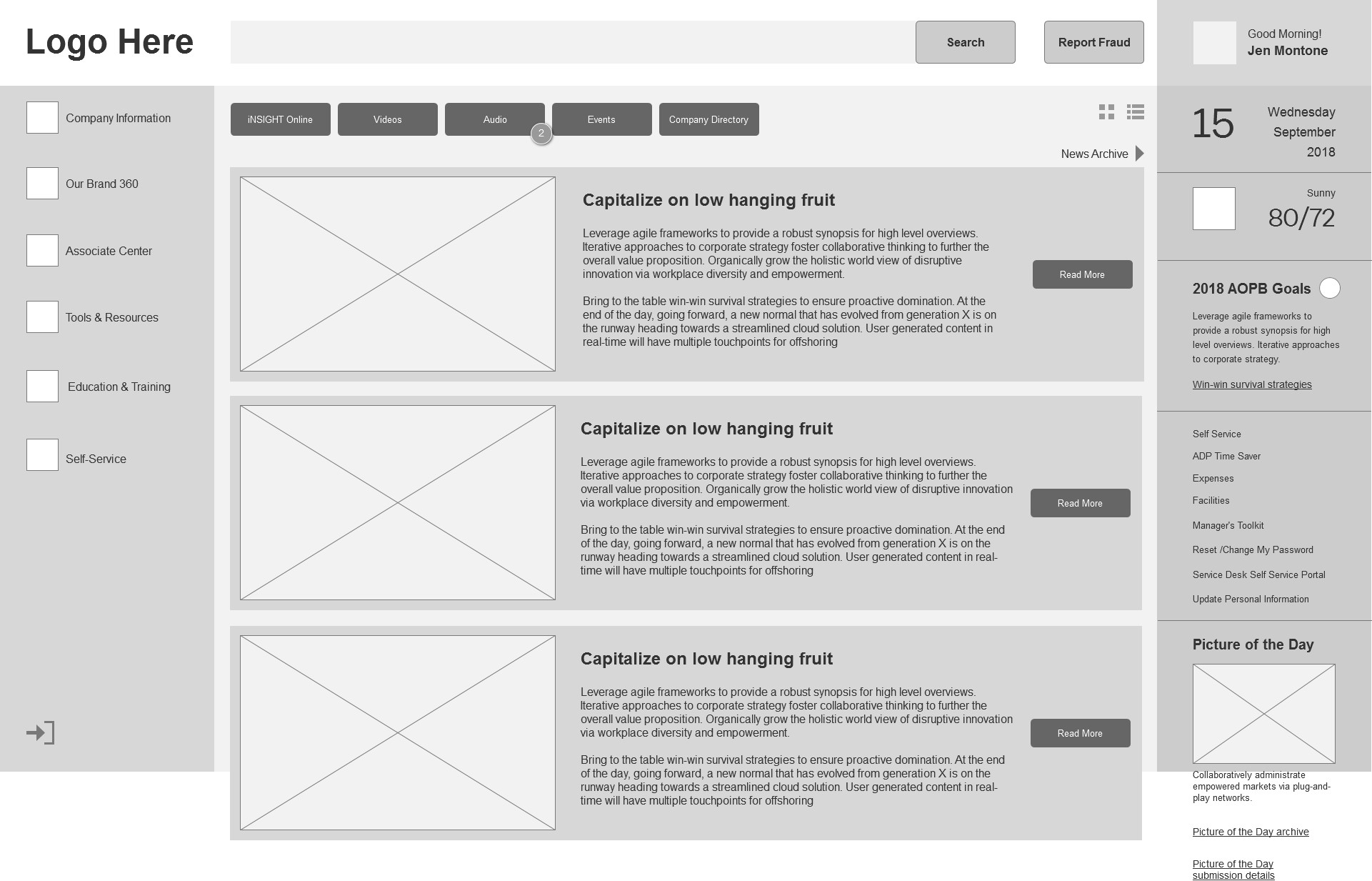
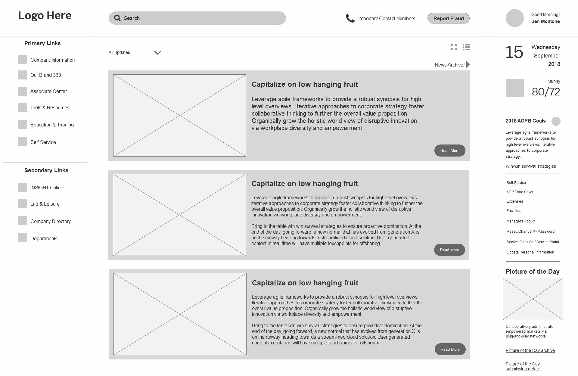
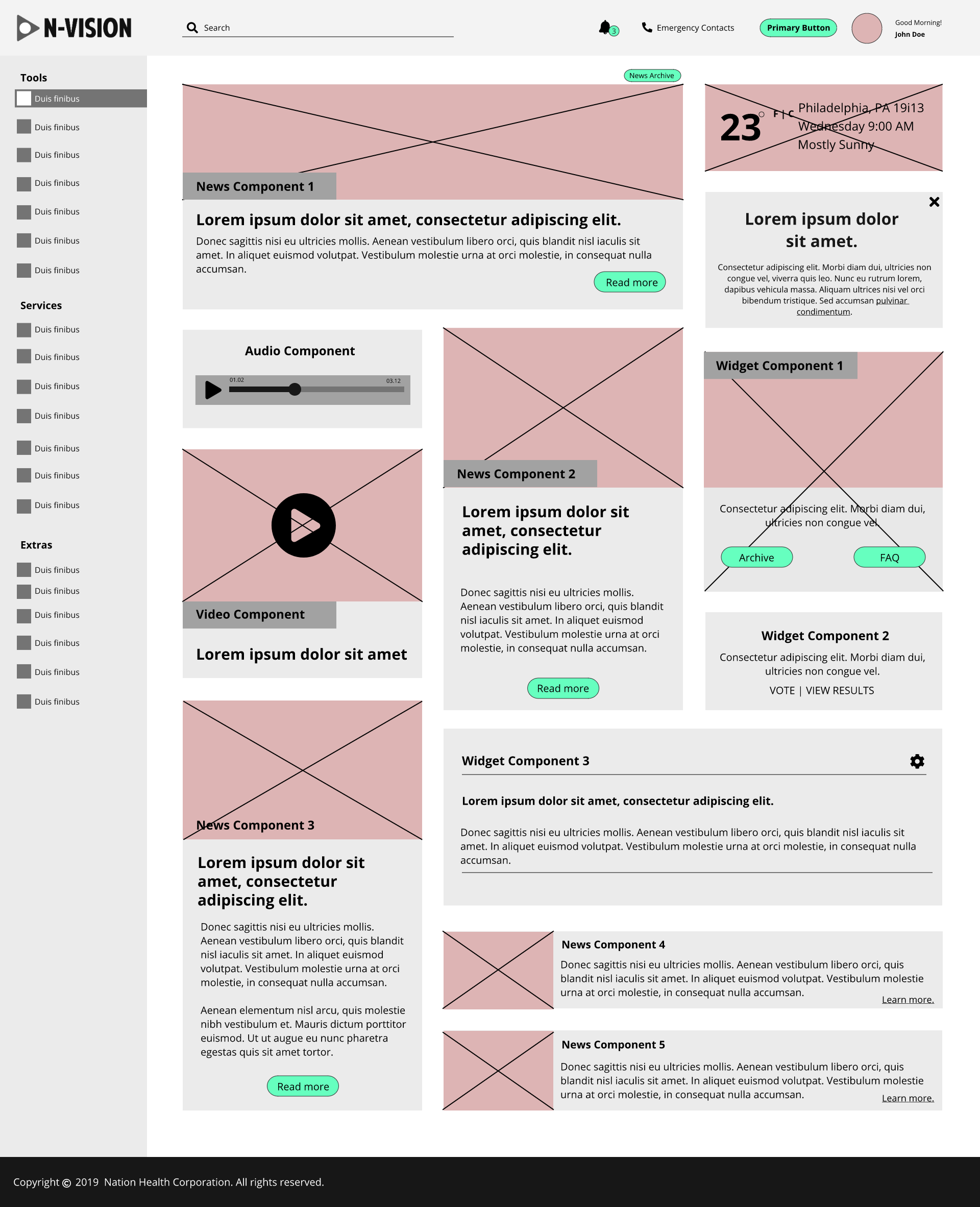
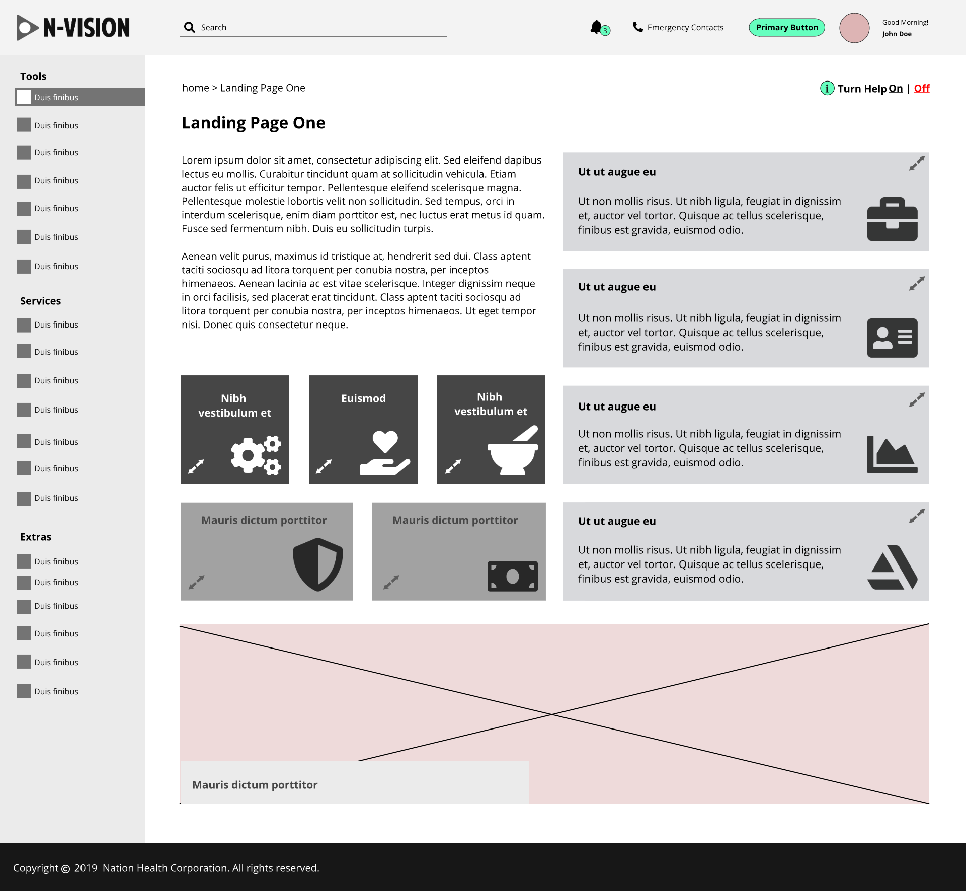
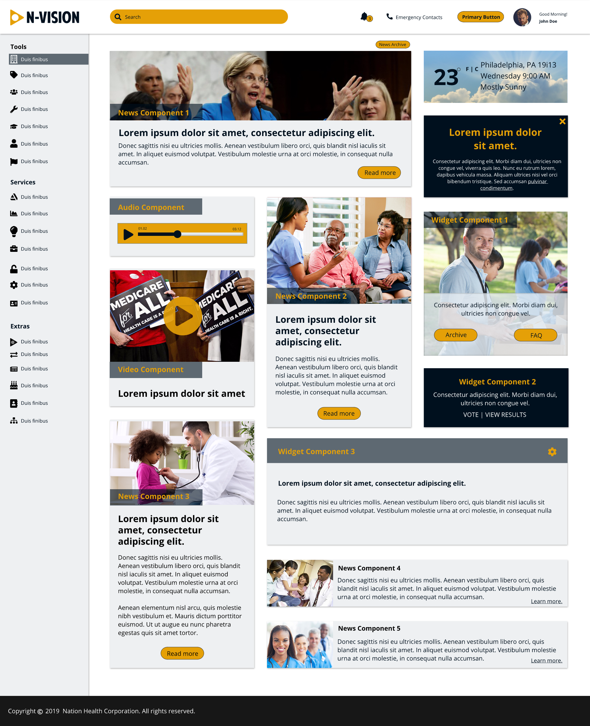
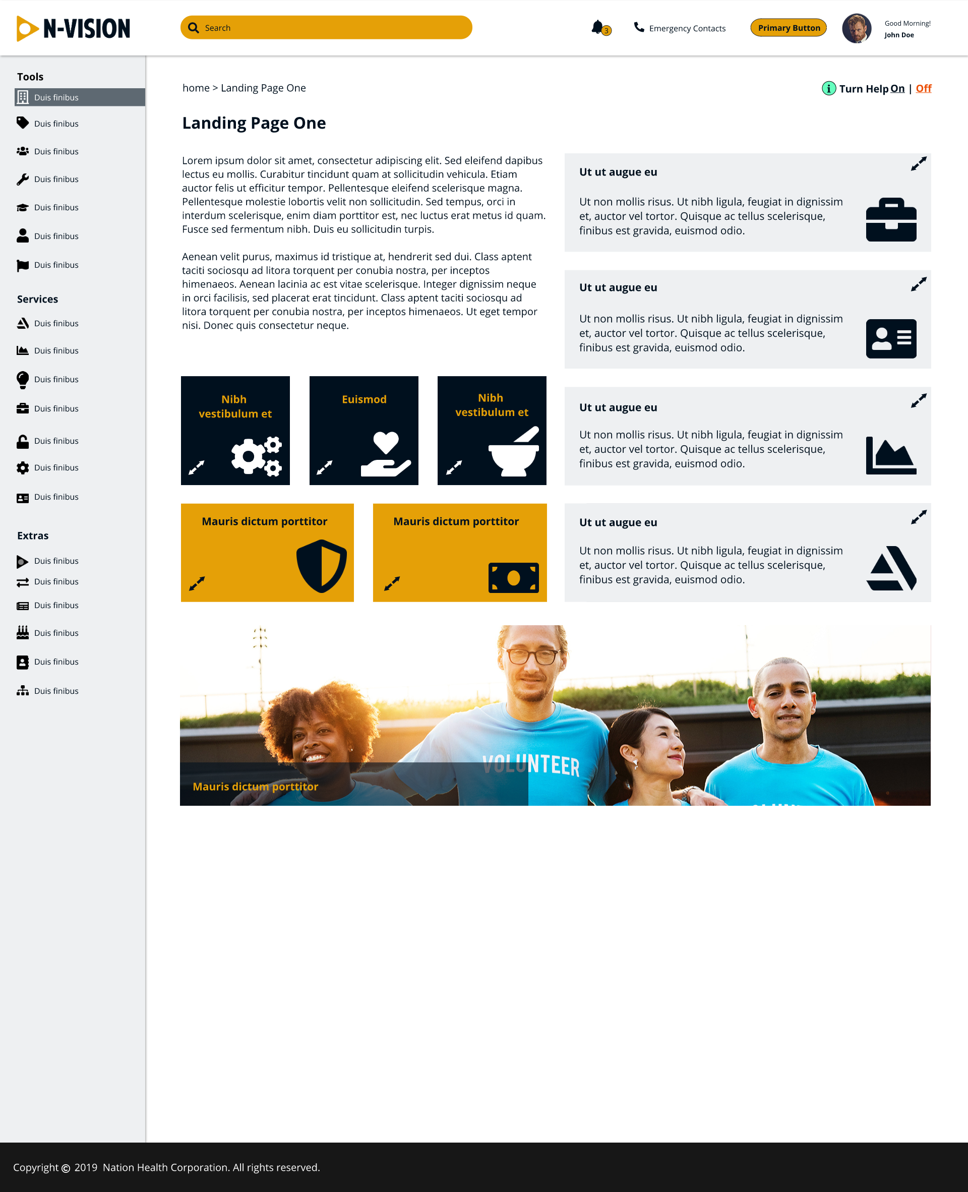
We decided to use a dashboard approach for the redesign. This would allow us to show more of the information that associates needed to find right on the home page and keep it present as the associate navigates the site. No more digging through pages of content just to access your timesheet. We also addressed issues of search usability by placing the search bar on the left of the screen and giving it more real estate, and a variety of legal issues by providing a robust alert structure and making it easy to report suspected fraud. We built in collapsible navigation that reacted with screen resizing and planned a progressively responsive experience which allowed us to add responsiveness through each phase of the project since the previous site was not responsive.
Mock ups
Because of the detail that we put into our wireframes, our mockups served almost as a color treatment for our in-depth structural designs. We were able to account for accessibility issues such as color blindness by paying close attention to contrast levels. We also established more concrete typography and icons.
The Conclusion
My team is currently in the prototyping phase of the project but all current progress has been successful and has been received very well by test groups. We are currently testing click throughs and animation effects to ensure usability and we have added toggle functionality to remove animations for individuals who are prone to motion sickness or seizures. We are in the process of creating a highly user centered experience that greatly improves the work life of our associates. That is no small feat for a massive company intranet.
Despite our current success there are still some valuable lessons to be learned. Most importantly, the process is not Agile enough. It is as close an approximation of the process as we are able to do in our current company culture but the lesson here is to continue to push ourselves and our leadership to move toward a more iterative process particularly when it comes to large scale applications.
This project is successful because it starts and ends with the needs of the user. Regardless of the size of the project or whether you use Waterfall or Agile processes, the user is the key component and we delivered great designs because we put them first.