Streamlining Site Activation for Clinical Trials
Overview
TrialStyle is a mock SaaS product design based on work that I did for a clinical trial company. There are many components to the Clinical Trial process. The Site Activation component occurs once a site has been selected and deemed feasible for conducting the clinical trial. Site Activation involves, collecting a variety of documents from the Country, Trial Sponsor, Site and Study Team. Training for the Study Team is usually required as well. All of this information needs to be tracked and cataloged according the workflow established by the specific trial and may require various individuals at different levels to sign off on a specific step in the activation process.
I believe in a minimalist approach to design and code. As such the goal of this demo is to advocate only for what is needed to perform the required tasks, this includes establishing a single, evidence-based approach to task completion rather than allowing clients to compose their own system. This positions the product provider as the expert on the most effective way to quickly manage site activation and saves time and money by reducing design and code complexity. I believe ultimately that users will thank you for making things easier on them, taking a layer of guess work out of the process and providing them with a cleaner interface to work in.
My Role
My roles at this company was Senior Product Designer and I was responsible for user research, visual design, copy, user experience and interaction design of the whole product. I partnered with a Product Manager and a Lead Software Engineer to create stories and manage development strategy.
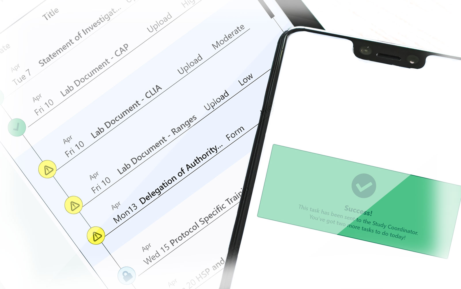
The Process
Existing Product
The existing product uses a nested approach in order to allow clients to organize the large amounts of content that can exist for a single site activation. The flaw of this approach however, is that it can nest content several layers deep and doesn’t provide an easy way to find the task that the user needs to complete. Additionally, metadata or any additional tasks that might be needed for a given task are not clearly defined in the existing iteration. My approach attempts to fix this issue by removing the nesting component, organizing the specific tasks by importance and making metadata or additional tasks clearly defined as a sub category of the primary task.
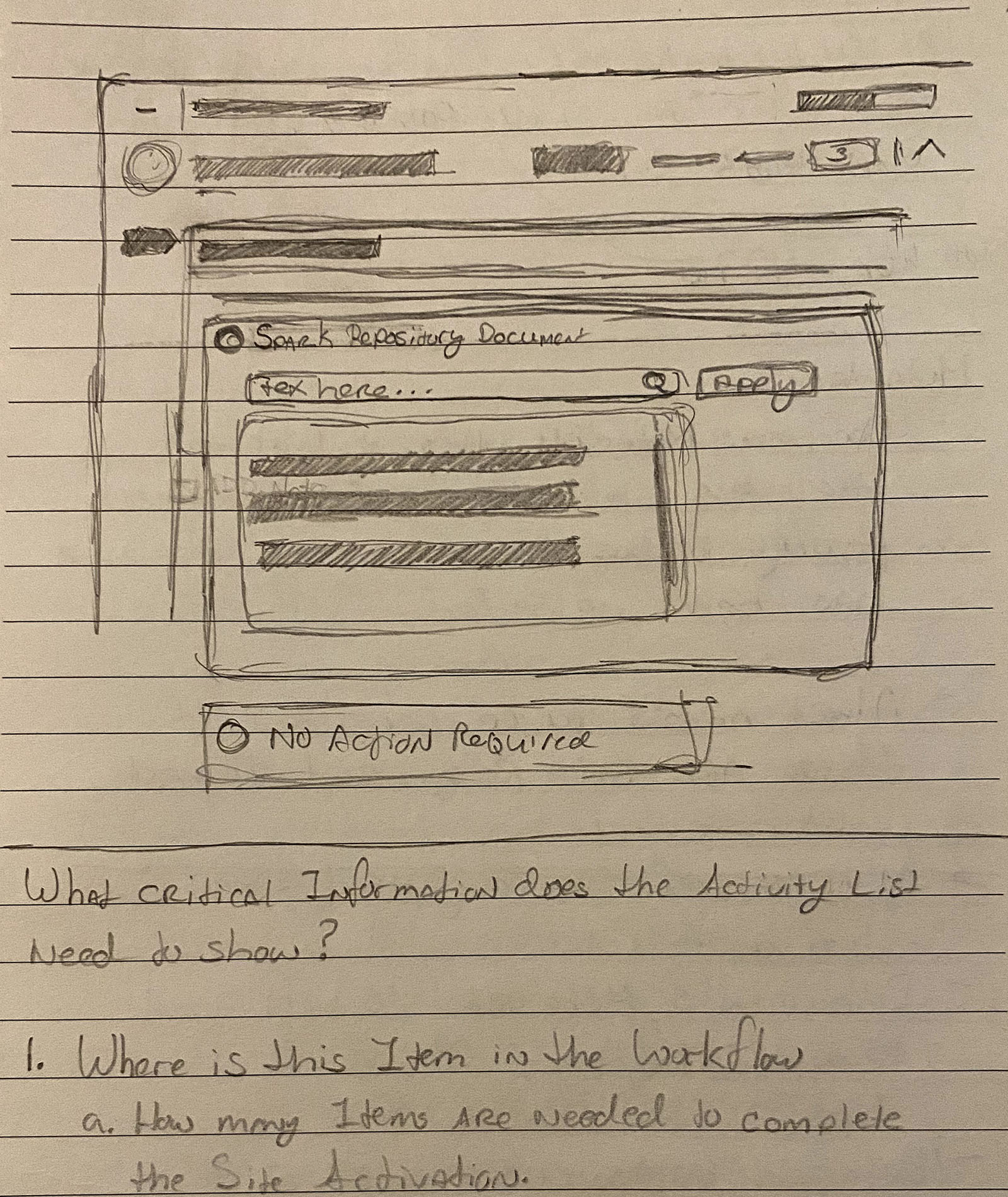
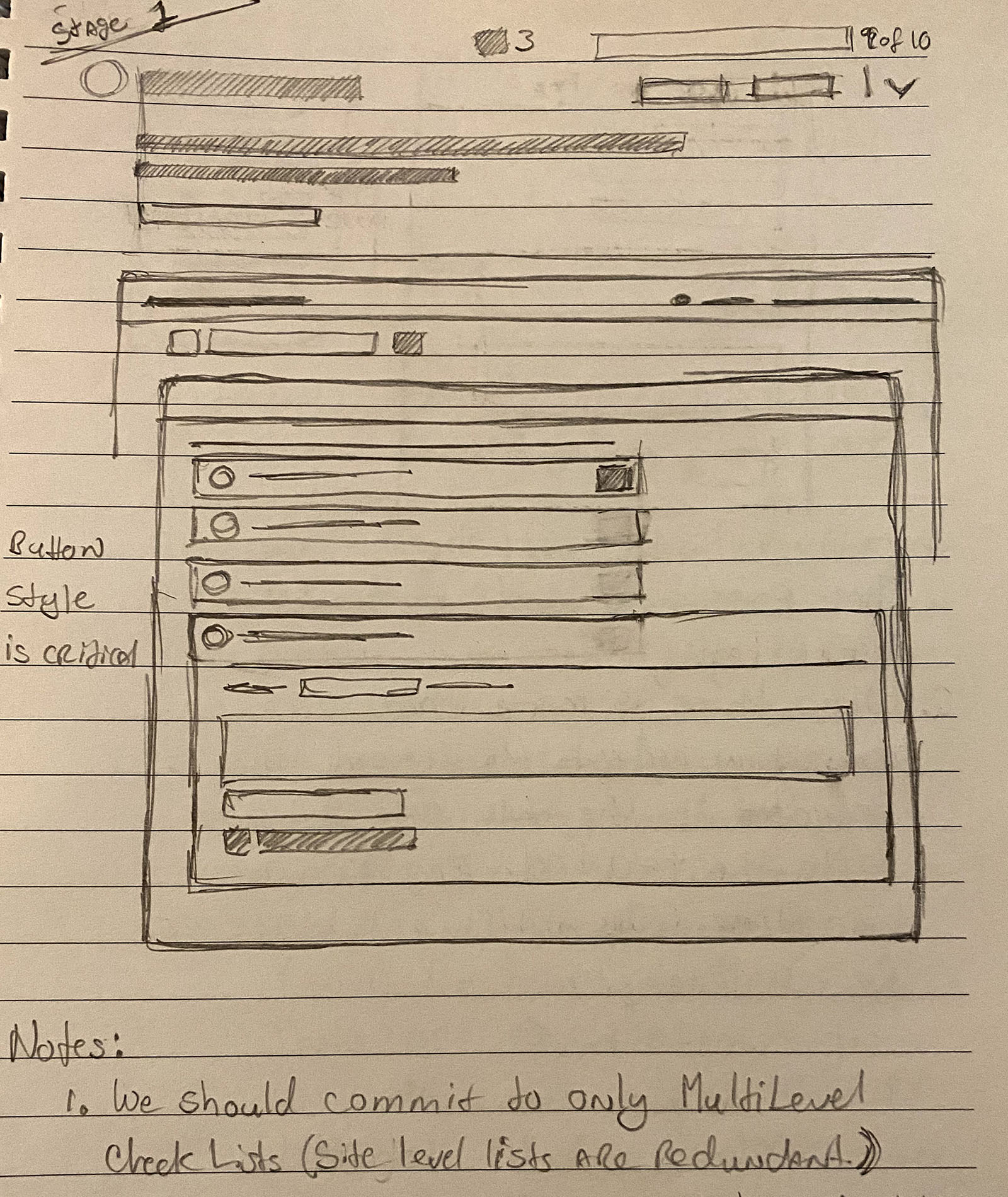
Early Research
Although I work specifically with the Site Activation component of Clinical Trails, it was necessary to get a fuller understanding of the end-to-end process as a part of my initial research. I gathered data from co-workers in various fields in the company, conducted competitor research, and gathered data from universities and medical institutions engaged in clinical trial best practices to get a thorough understanding of the challenges of the clinical start-up process.
My Initial hypothesis assumed that users would want various analytics data provided alongside the task list. My goal was to provide real time feedback to the user about the health of the site and any blockers that could cause site failure. However, upon talking with users and getting a clearer sense of their pain points, I realized that while this sort of information might be useful to a certain type of user, the most basic user simply needed a clear path indicating what they needed to accomplish and confirmation that they had completed their task successfully.
Personas
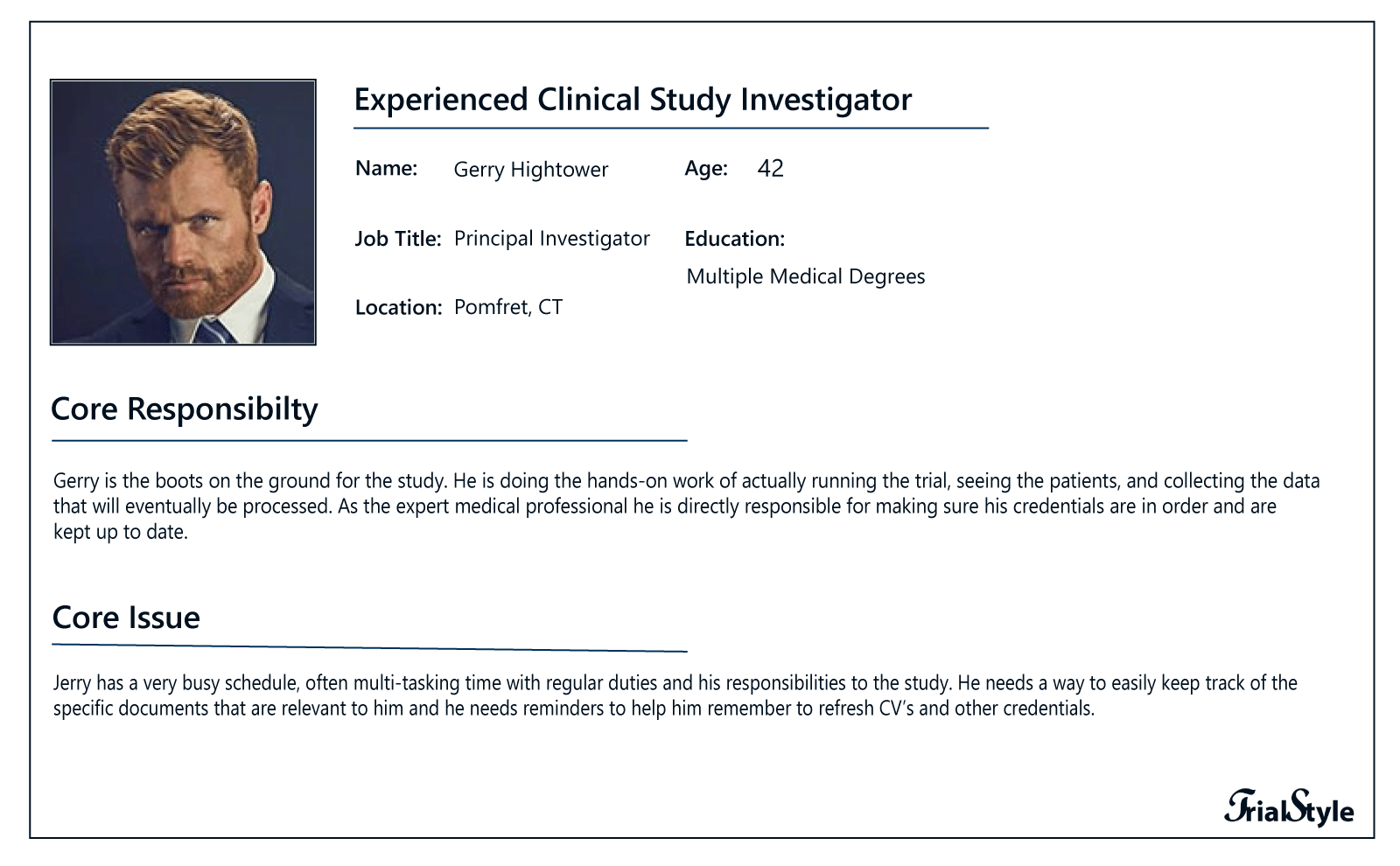
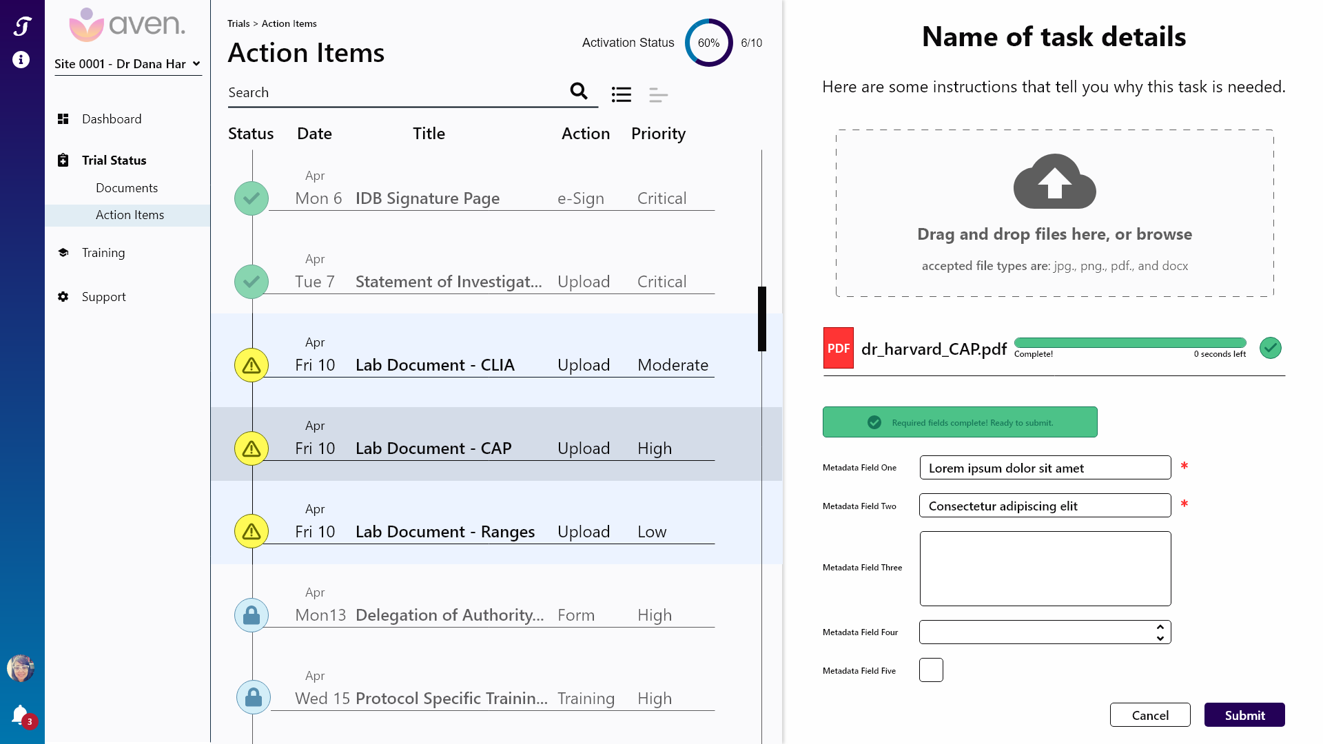
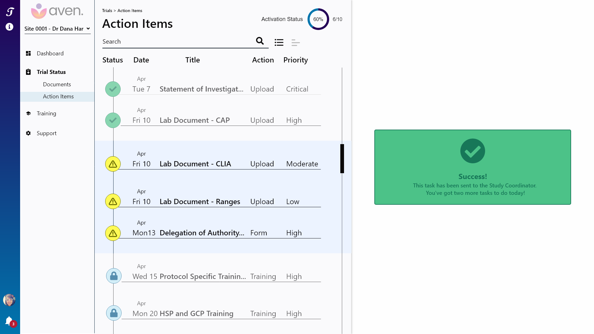
While there are several types of users associated with a SaaS product of this scale, for this demo I have focused on one, the Principal Investigator who I have named Gerry. Principal Investigators actually run the study at the site level and they will need to provide various documents to Study Coordinators to keep their personal credentials and certain site credentials up to date. While Gerry has various pain points that relate to the product as a whole, this demo focuses on his need to quickly upload a required file, provide any requisite meta-data and get a confirmation that the task was completed. It is worth noting that a Study Coordinator could also complete this task.
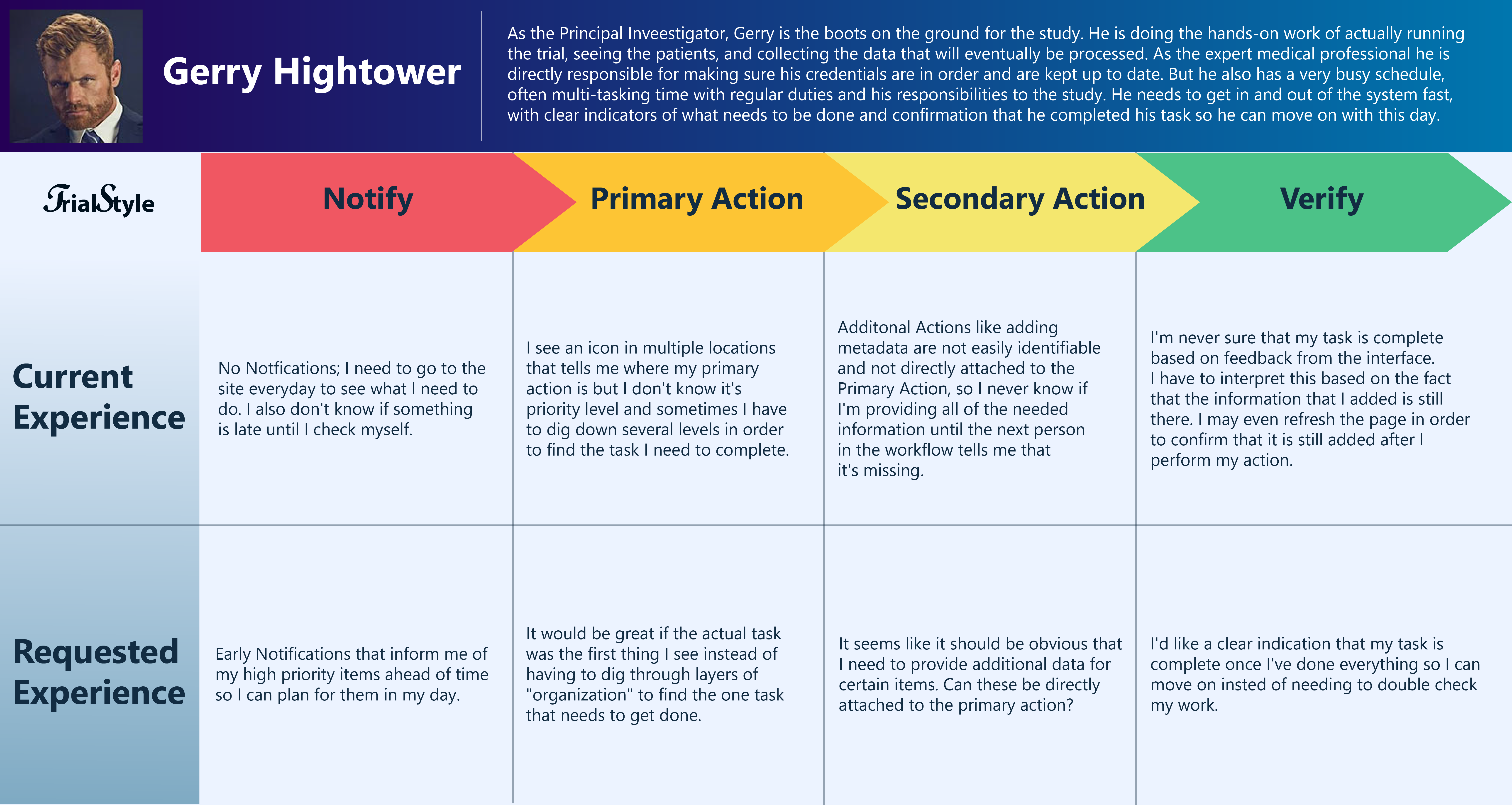
This simple Journey Map compares the existing experience as described by users like Gerry with the desired experience that they said they are seeking.
Wireframes and mock ups
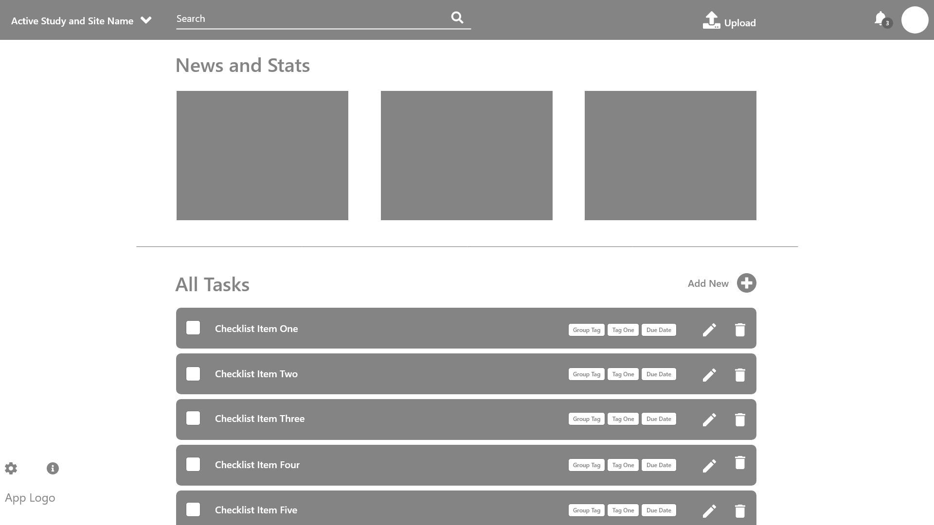
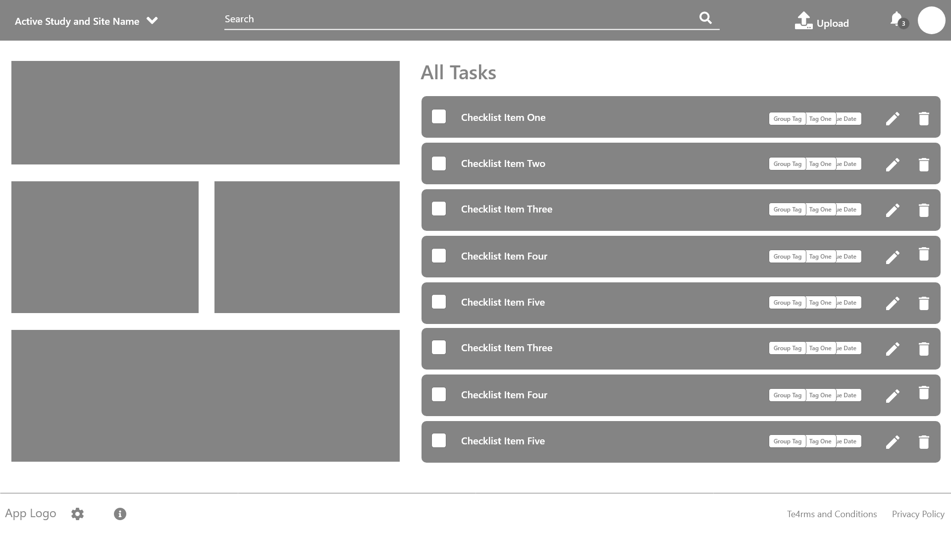
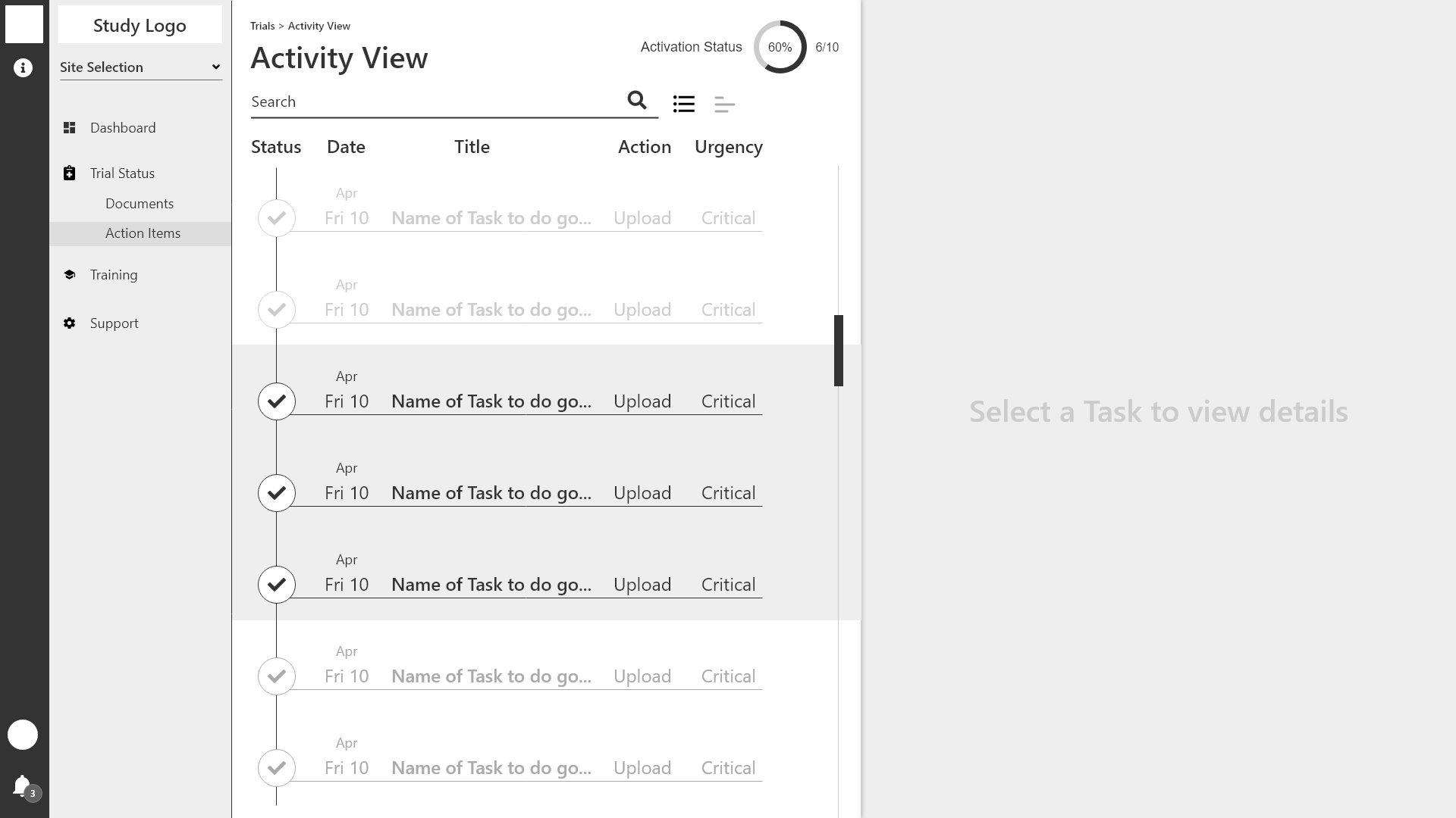
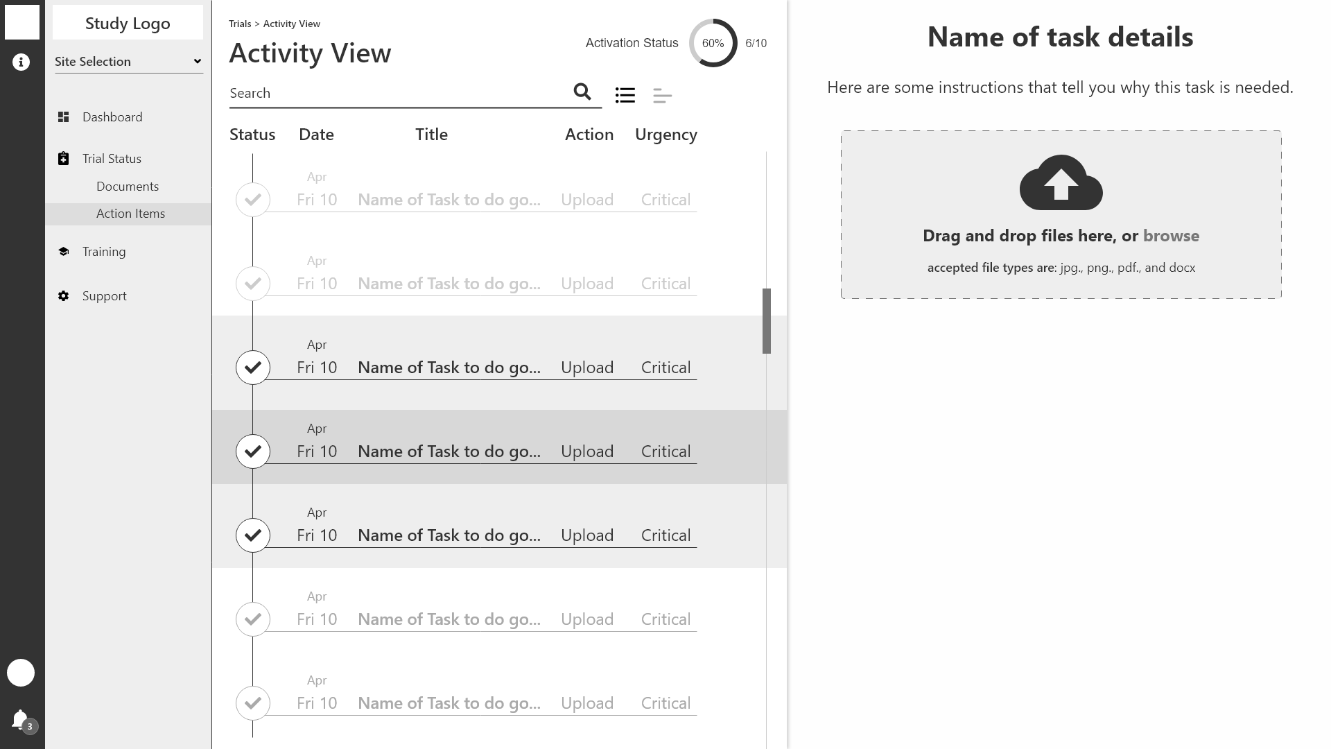
Based on my early discoveries, I was able to put together a fairly detailed wireframe and then proceeded to build out the key frames of the user flow. This allowed me to focus mostly on details, colors and some light branding in the mock ups phase. I have found that this is my preferred method of working as it allows me to solve specific problems at each stage. I also noticed a few frames that were missing in the wireframes stage and I was able to easily add them in. The issue of notifications is addressed with email and or text alerts which let the user know what tasks need their immediate attention.
Considerations
Although this demo hits all of the pain points as mentioned by users, there are some things to keep in mind. Most obvious is that this only addresses one users pain points. There are at least three other core users that need to be considered for this product as well as a product admin view. Future iterations of this design would seek to create the right experience for each user type based on how they use the product on a daily basis. So, the view that a Country Lead sees is not the same as what a Study Coordinator, Principal Investigator, Site Sponsor or Product Admin would see.
Additionally, I am advocating a single workflow method for the whole Site Activation component. Other products may work with the client/user to create the workflow that works best for them. I disagree with this approach as I believe a healthy product design does not try to be all things to all people but rather provides and advocates the most consistent experience based on the best available and current research. This may create a learning curve for existing users if you have a previous system implemented, but consistent, transparent and effective user testing should mitigate these sorts of growing pains.
The Conclusion
I see a lot of room for lean design when it comes to medical products. This is especially true in Clinical Trial Software. Many times, modern designers and developers are fighting an up-hill battle and being forced to make something look and feel new without getting rid of the old components that a company is married too for one reason or another. In these cases, design is often an after thought rather than being considered as a holistic component of a well-crafted product.
This demo is based on a fair amount of research but it only scratches the surface of what a solid product could provide as long as it remains focused on providing the needed tools to achieve a successful site activation and doesn’t get bogged down, trying to be everything to everyone. Using the insights gained from this project, I plan to build more components and conduct deeper research.
Stock Photos provided by Scott Graham and Obi Onyeador on Unsplash