One company. Two brands. A “unified” web presence.
Overview
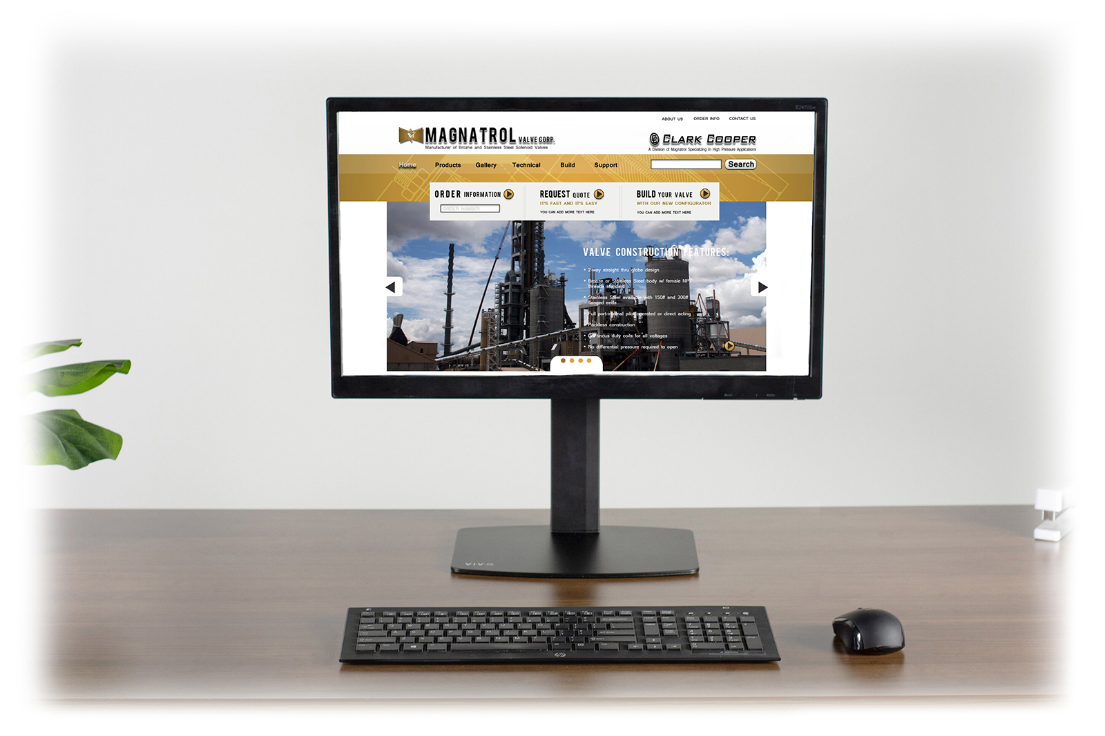
Magnatrol Valve Corp. has been manufacturing high quality solenoid valves since 1936. In 2003 they acquired Clark Cooper Corporation, a manufacturer of high-pressure solenoid, custom engineered and special alloy valves. Each had carved out their own reputation within the industry and they maintained separate web presences with little connection between the two. In 2011, Clark Cooper hired me to help them remedy this separation by developing a single website for both brands. The challenge then became how to merge two very different brands in a way that was respectful of both while allowing the user experience of the site to standout in spite of this dichotomy.
My Role
I served as a full stack developer on this project and was responsible for design as well as front-end and back-end code. I also collected and redesigned web graphics and print collateral.
The Process
Early Research
Since I had no previous experience in the valve industry beyond a limited understanding of a valves function due to my time in the military, my early research consisted of an initial audit of the current sites, competitor research and general research about the industry overall. I didn’t have direct access to users or clients so I conducted interviews with in house engineers, managers and customer service representatives to get a better understanding of user needs.
Establishing Brand
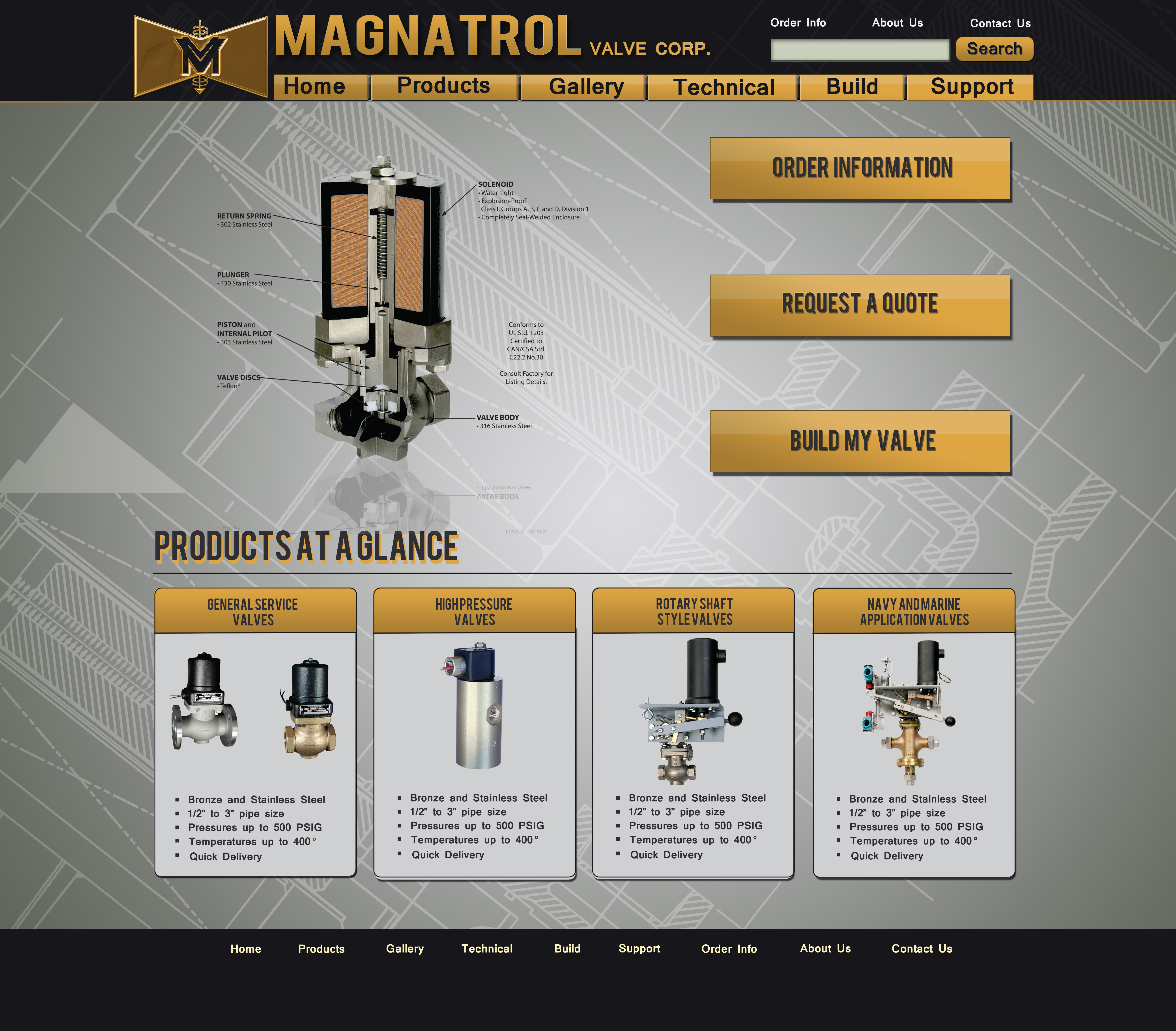
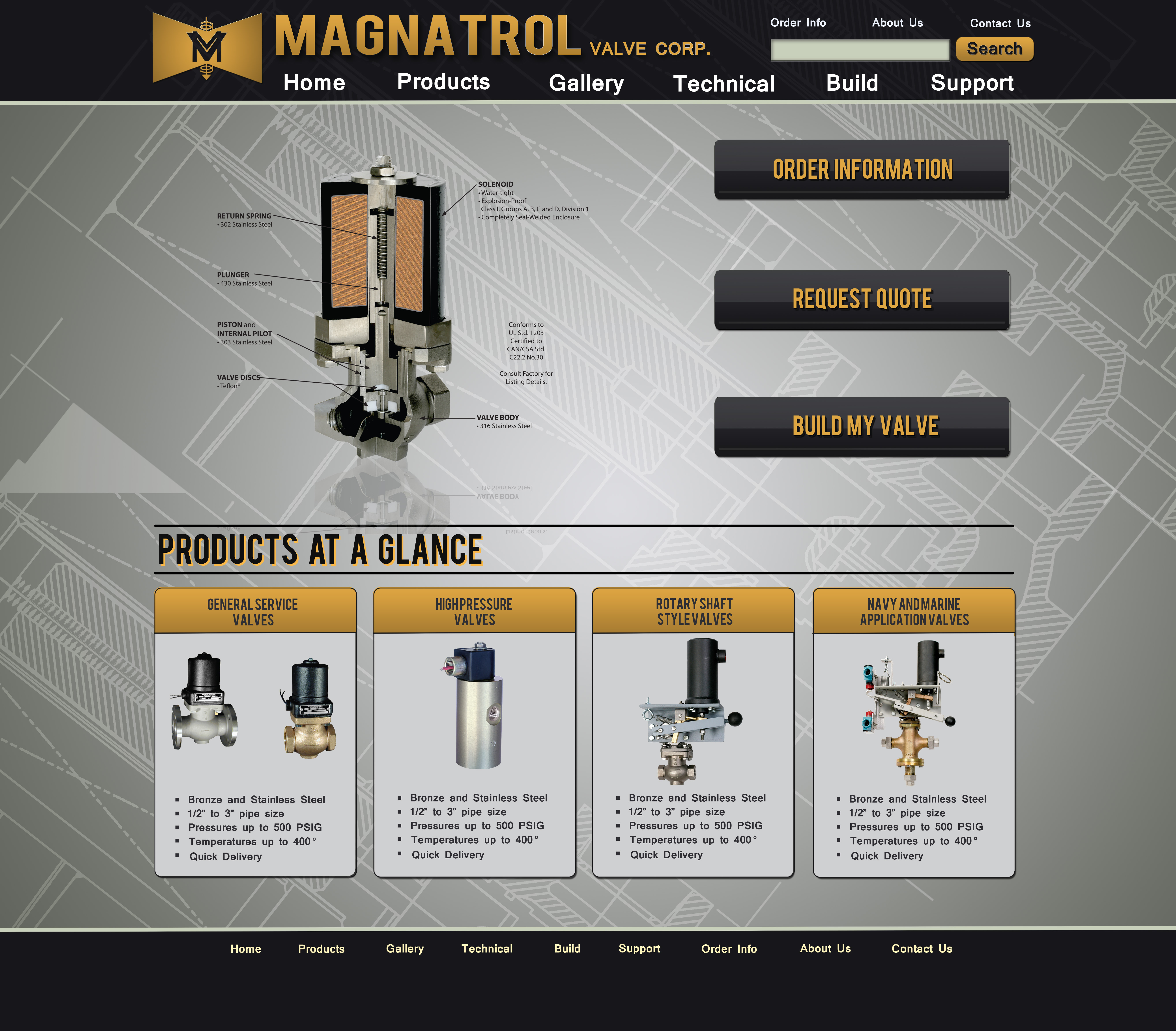
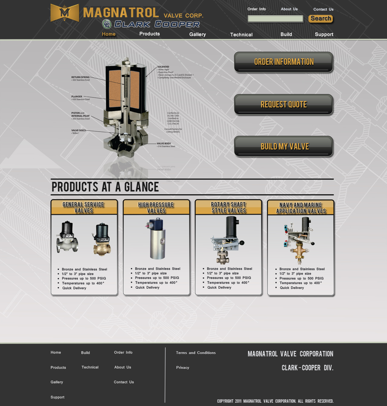
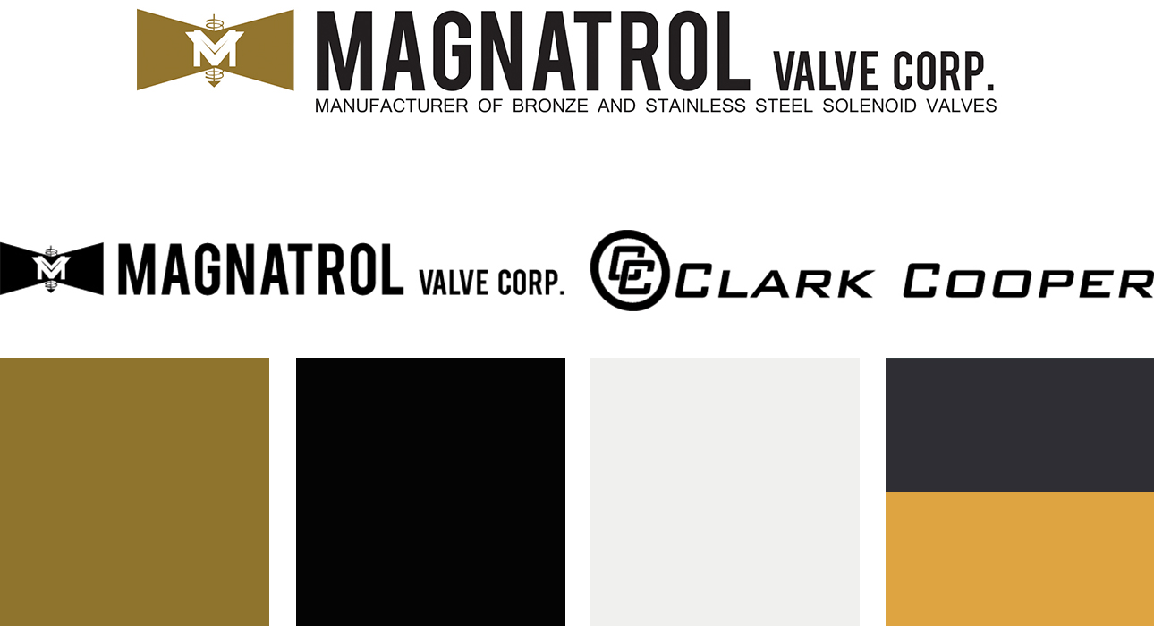
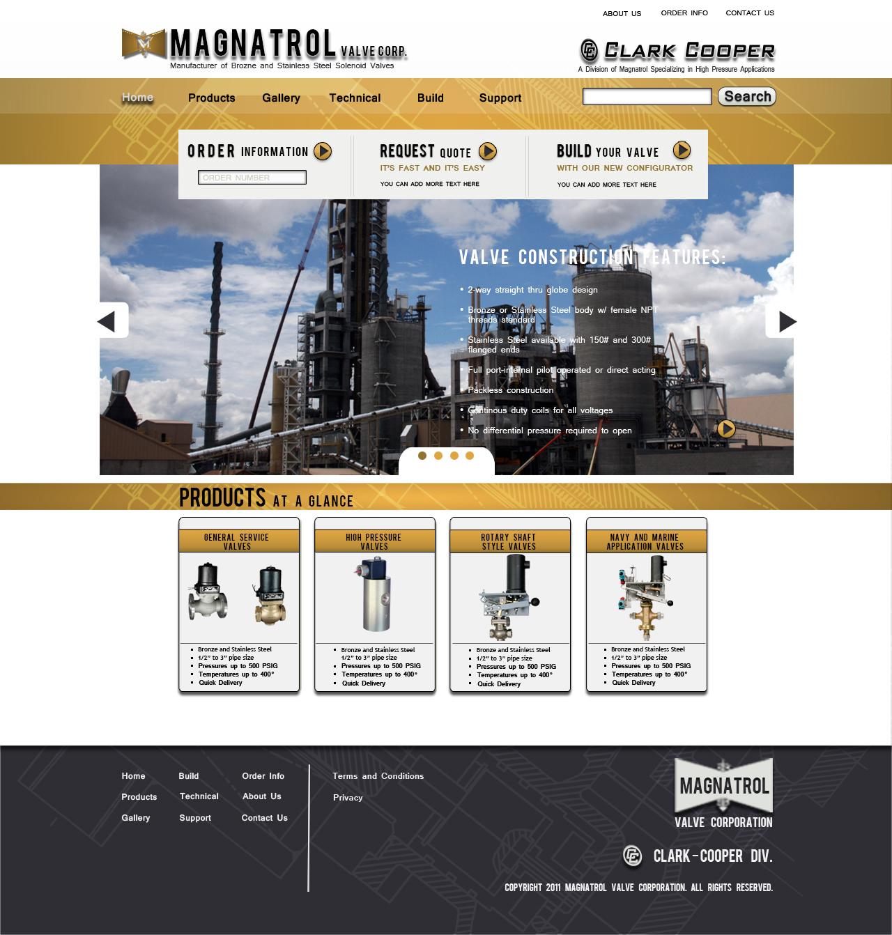
Branding was tricky since there were essentially two well established brands seeking nearly equal real estate on the same site. I did try to encourage a logo refresh for the Magnatrol logo as it was difficult to work cohesively into a design but the most challenging part was finding a unified color palette and typography that both brands were ok with using since there existing colors were highly divergent and neither was keen on sacrificing a bit of their brand identity to create a unified experience. While we didn’t end up changing any logos, we did end up settling on colors and typography. The early concept work used a dark color scheme. Magnatrol thought this gave off a negative vibe so we went with light colors that were close to the Magnatrol brands original colors but diverged to express and “new and improved” feeling.
Wire Frames
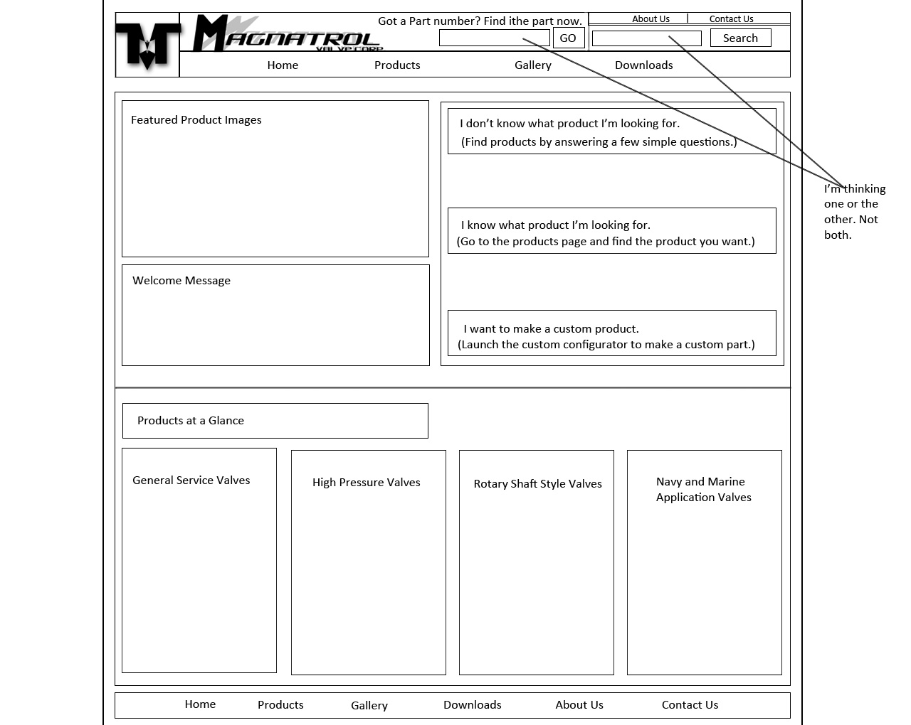
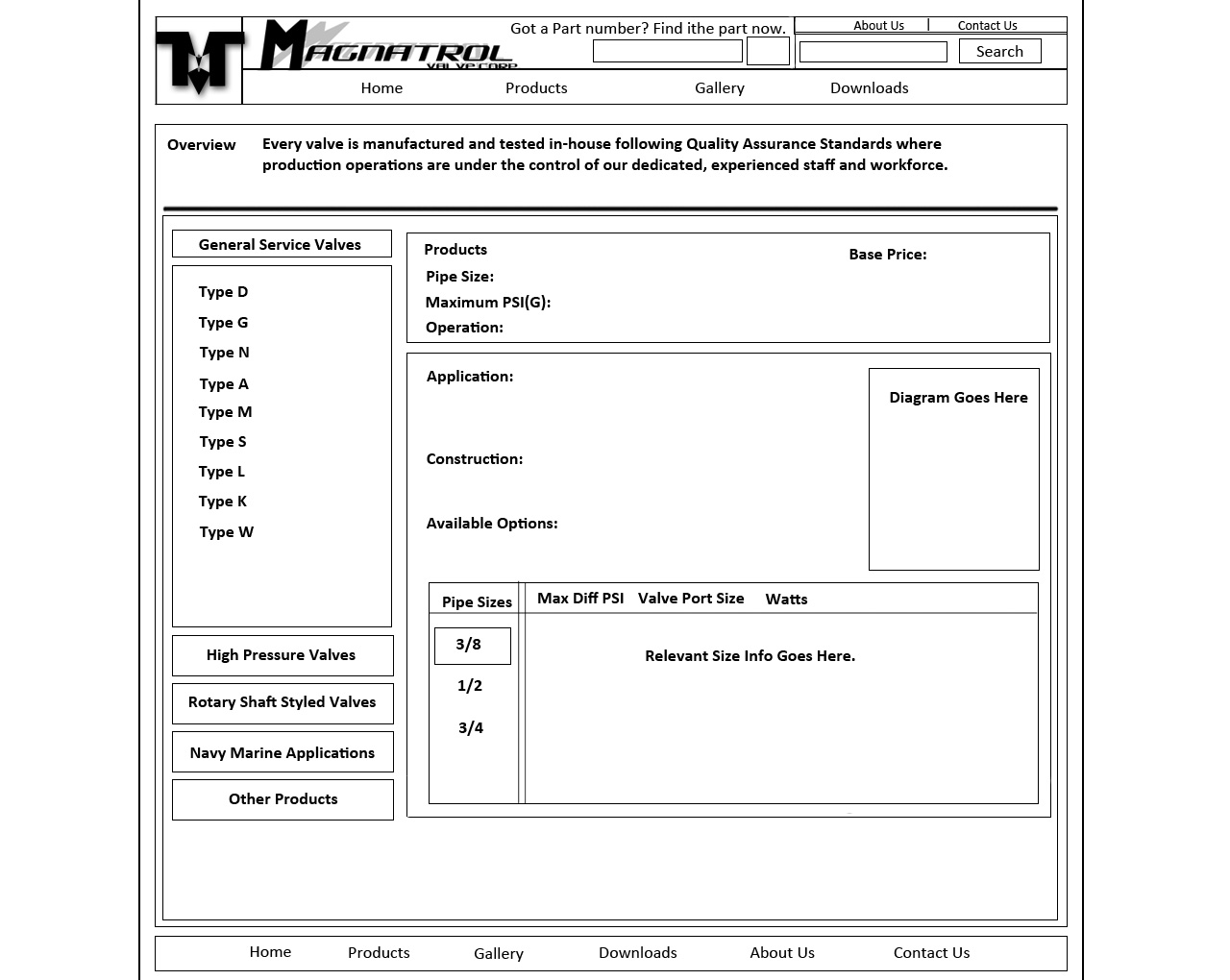
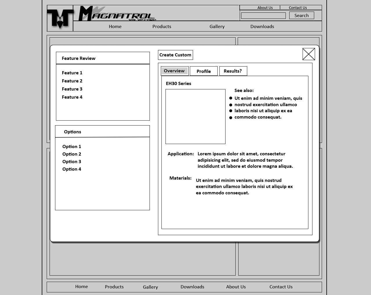
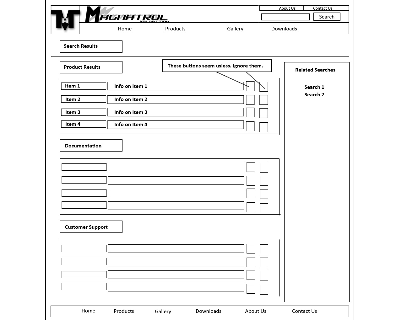
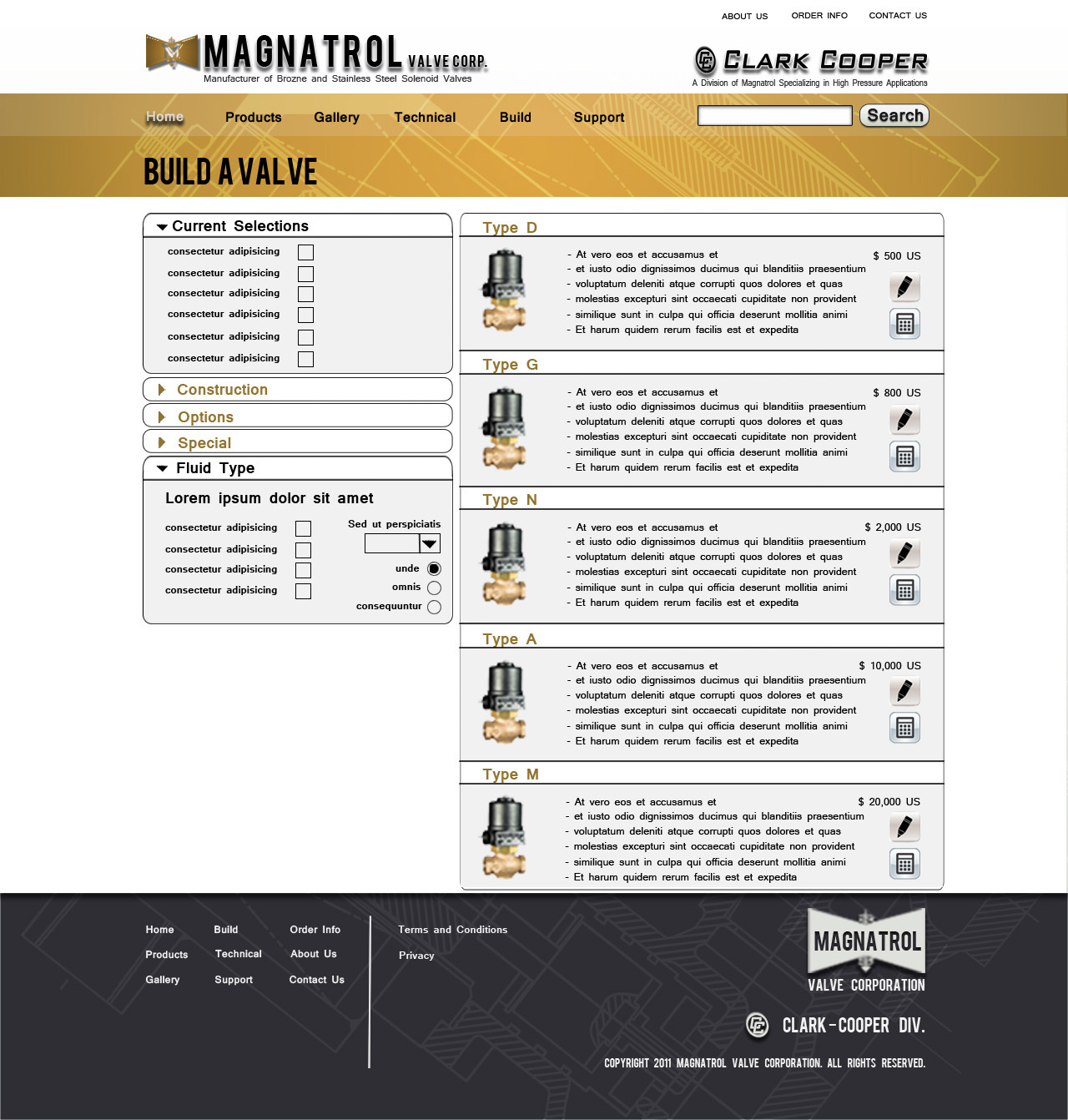
The wire frames for this site showcased a variety of features that neither of the existing sites had in them. We used a modal window to showcase expanded valve properties and features. We add search functionality and image sliders to showcase featured content. We even designed a way feature recommended valves or created a custom valve based on user feedback.
Mock ups
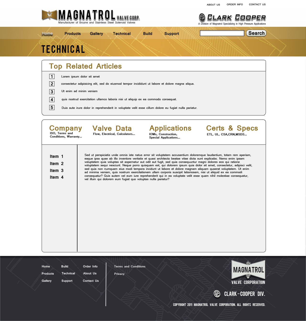
I made multiple mock ups for every page of this site. Mostly because there was so much back and forth with colors and typography. We also went through a point when we realized that we weren’t happy with the direction of the site structurally so we choose this point to go back to the drawing board for the most dynamic pages like the homepage and the valve selection pages. This resulted in a more robust site design overall.
The Conclusion
We constructed a completed site. But due to a variety of circumstances concerning branding, we ultimately chose not to make this site live. While we succeeded in creating a dynamic user experience, we could not resolve the logic of hosting both brands on a single site.
The core lesson here is communication. We succeeded in creating a successful user experience because all parties were on board with what needed to be accomplished and we executed on a unified vision. We failed to build a successful co-branded site because we failed to find that shared vision in regards to brand. However, the successes and failures of this site were critical in exposing the real needs of the client and forced us to question whether we were putting those needs ahead of the user experience.
The only real failure is a failure to learn and adapt. This project is probably more valuable to me than any of the projects that I did afterward because I was able to use it to create a foundation of my personal do's and don’ts of user experience design. This project taught me the importance of process, communication and setting goals and the need to keep those things in perspective in order to achieve success.